Today I am excited to announce my new project called “Power BI Lessons”. I will publish a new video every Thursday about a different topic on Power BI.
In this first video I will teach how to build your first dashboard from zero, step by step. I’m going to present a method that has 7 steps since to connect to the data until publishing and schedule automatic update.
Next week I will talk about DAX, Filter Context, Row Context and the CALCULATE function. All my videos tend to be longer than normal, because I like to go deep on the matter so you can learn for real.
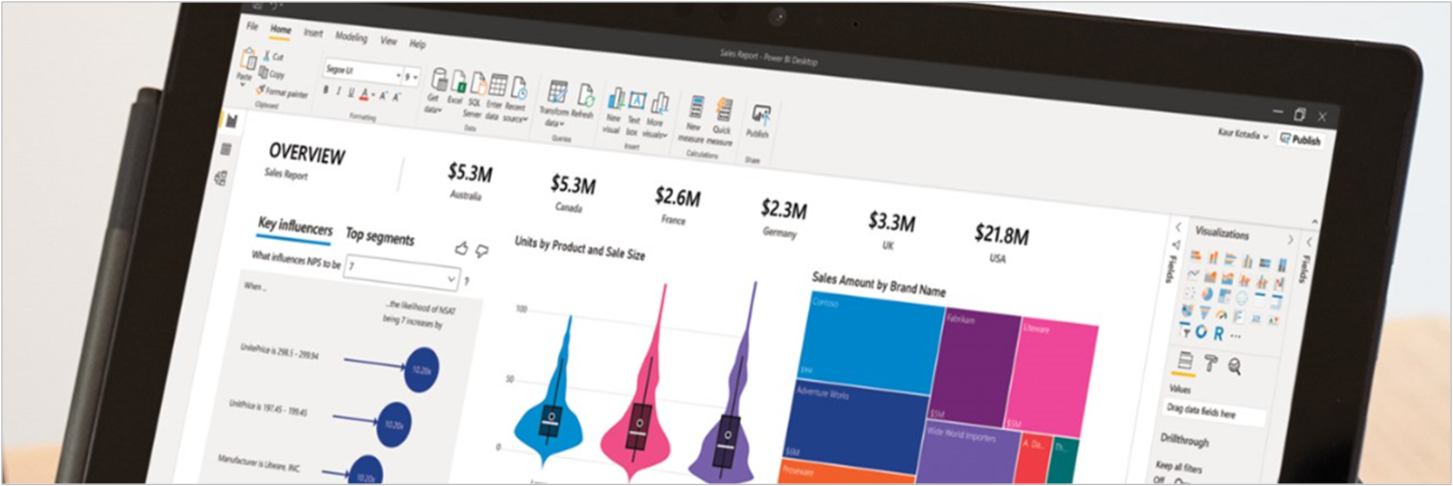
Today, we will build a Sales dashboard. Let’s get started?!
We will begin with the 7 pillars for Mastering Power BI:
- Extraction (the data from the source)
- Transformation
- Modelling (create table relationships)
- Calculation (where we build KPI’s)
- Visualization
- Distribution (publishing)
- Automation
From 1 to 5 we use Power BI Desktop. It is our development environment.
From 6 to 7 we use Power BI Service.
Therefore, we have two types of PBI. Desktop = (free) software and Service = online version.
Downloading Power BI
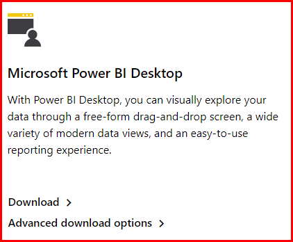
Go to your browser and search for “Power Bi Destkop”.
Power BI is a Microsoft software (just like Excel, Word, etc). To download it we will search the internet “download Power BI”. By clicking on the first link, we see two options to download the file. One of them is the option to download from the Microsoft Store (for those who have Windows 10) and the other to download from the browser.
Search “download Power BI” on Google → Enter the first link → Click on “Advanced download options” → Select your language in the checkbox → Click on “Download”.

or
Search “Microsoft Store” on Windows → Search “Power BI Desktop” on Microsoft Store → Click Download
Every month it has a new update. Be aware!
Starting to build our dashboard
The first thing to do after you have already installed the Power BI, is to import data (in this case from Excel).
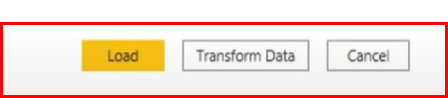
Once you open the spreadsheet, the navigator will show options, and if you would like to transform data (my suggestion is that you always do this first). Then Power Query Editor will open, so we can transform our data.
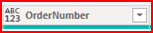
You must check the data type of the columns and see if you will have to adjust something. Every time you see ABC123 is because the column is not with the right configuration.
Once the information is ok, you go to “Home” and “Close and Apply”. Then you will have your database to work on.
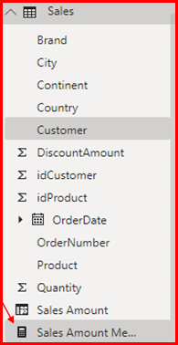
On you right side, you will see “Fields” there will be the columns title. You choose the ones you need to work, and it will open on the blank space.
When clicking outside the visual, you can choose a different way to start. Choosing a different visualization type. On the example the “Area Chart” was chosen, then you must choose the column to “Axis”, “Legend”, “Values” and “Secondary values”. You can just select on the box next to the column name, or you can drag and drop.
If you would like to change the information on the graph, you can just uncheck the box, and choose other.
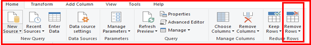
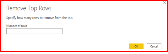
In case you have a file that is a sheet, you transform data. If there is any column with “null” you won’t use, you go to upper top and find “Remove Rows” → “Remove top rows”
Then you put how many rows you need to delete:
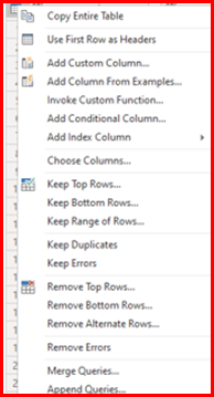
After doing that, you have to check if the new first row is the header. If it is, you must adjust it. Just like the example I gave in the video. On the calendar on your upper left, you click on that and choose “Use first row as Headers”. Let me show you:
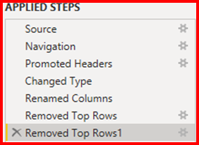
If you made a mistake and want to undo, you are able to delete your preview action.
In Power BI, whenever you have values, like “Budget” used in the video, you have to put all values in one column and sum them up, because it can duplicate the values.
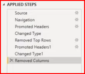
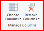
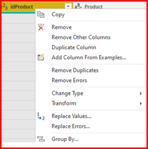
To delete the columns: select the column you want to delete, and use the right-click, it will appear the option “Remove Columns”. And automatically another step will be applied.
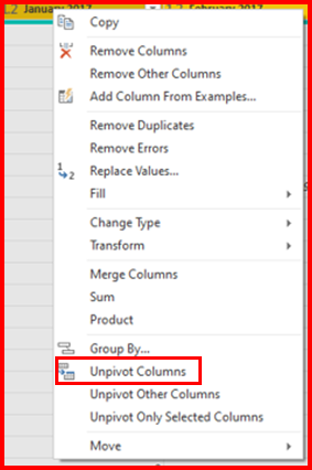
For a better visualization, when you have to many columns, you can unpivot them and will be summarized.
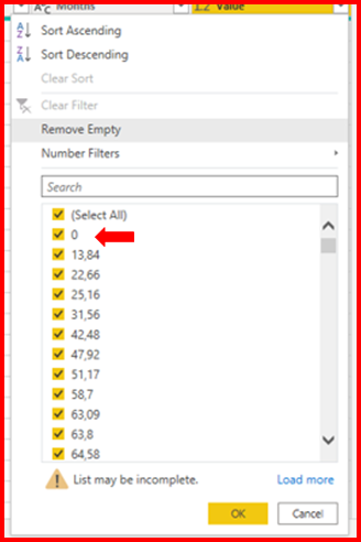
We can consider the value zero as null, so click on “Value” with the right-click and uncheck 0.
After you are done doing the changes, you can click on “Close & Apply”.
Modeling Phase
This step aims to contemplate the logical and structural organization of links between each functionality.
The information is connected through tables, this means that each field will have some interaction with another field in another table, having connections between them.
Calculation
For calculation Power BI uses a language called DAX (Data Analysis Expressions).
There are 2 ways we can calculate:
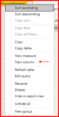
1. You can create a new column with the right-click and “New Column”.
Then in the formula bar you write the formula to get to the final amount (the one that we need).
Sales amount =Sales[Quantity] * Sales[UnitPrice] – Sales[DiscountAmount]
This is not the preferred approach because every time you add a new column it uses more memory (from your computer and your table) and it affects the performance.
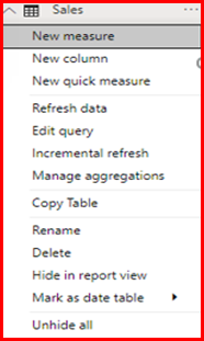
2. Create measure instead of creating columns.
Click with the right-click on “Sales” and then click on “New Measure”.
Whenever you create a measure you must summarize a column. It doesn’t work if you copy and paste. The perfect function for this to work is: DAX function.
In order for this formula to work, you have to sum all the values in the column. The function “SUMX” will sum all the values in the table, and then calculate the expression we want (“Sales[Quantity] * Sales[UnitPrice] – Sales[DiscountAmount]”).
Sales Amount Measure =SUMX (
Sales,
Sales[Quantity] * Sales[UnitPrice] – Sales[DiscountAmount]
)
After that you will be able to see a calculator on the right.
Going back to the Report tab, you will select both to check if the amount is equal (and sure is).

Since the result is the same, we can delete the calculated column (“Sales Amount”).
Then after you delete it, you have to update the formula deleting “Measure”.
Sales Amount =SUMX (
Sales,
Sales[Quantity] * Sales[UnitPrice] – Sales[DiscountAmount]
)
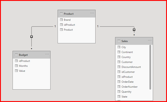
On the relationship tab we can se the two tables. We have to create a table for “Products” so we can relate both tables in one.
There are 2 types of tables that we have in Business Intelligence, that we are going to see on the next videos, Dimension and Fact tables.
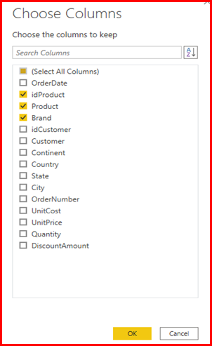
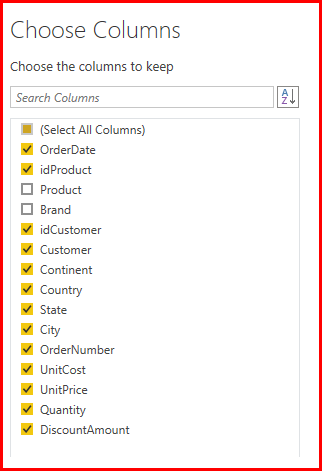
In order to do so, we are going to open Power Query Editor again, duplicate the table “Sales”. Then you are going to choose the columns that are only related to the products.
Whenever I have a dimension table, I must have a unique column, for example:
We can’t have duplicate information. You have to delete the duplicates.
Click with the right-click and choose “Remove Duplicates”.
After done that, you have to go to “Sales” table, the “Choose Column” and deselect “Product” and “Brand”. Then do the same in “Budget” table.
After that you can click on “Close & Apply”.
When we go to relationship tab, we can see that Power BI has already updates the information:
When we choose the information we want, which in this case are “Brand”, “Sales Amount” and “Value”, the graphic is like this:
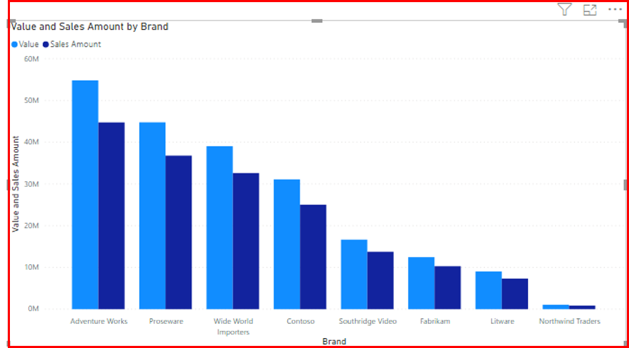
I don’t know if you noticed but in the upper right there is no arrow, right?
If we select “Product” in the Product table, the graphic updates to this:

This is called “Drill-down”. In this case is from “Brand” to “Product” that are the information on Axis.
Regarding modeling there is one last thing to do, create a “Calendar/Date” table. And how can we build this? With Power Query or DAX. This time we will use DAX.
You will click on “Modeling”, and then in “New table” and the formula bar will appears.
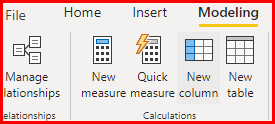
We will use the function “CalendarAuto”:
Date =CALENDARAUTO ()
And a new table has been created “Date”. Now you go to “Relationship tab” to relate the columns in common.

Tip: Try to use measures instead of columns in visual. Power BI automatically calculates the sum. This is called implicit measure. For now, just avoid. We will talk about this later.
SUM ( Budget[Value] )
When you want to make a division, use the function “DIVIDE”.
Sales vs Budget =DIVIDE (
[Sales Amount],
[Total Budget]
)
When you use this function, and some letters appear in purple is because you are using a measure that has already been calculated.
Tip: always try to use the same color on the visuals to make it easier for the viewers.
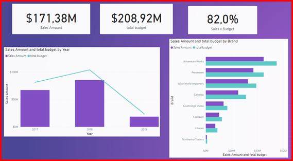
And that’s how our dashboard looks like! Pretty great, huh? Congrats to you for staying here and learning about Power BI!
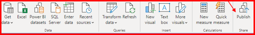
Now you have to save the file and then publish. In order to do so, you have to have an account for Power BI with a corporate domain.
The first time you publish, your email and password will be required, and choose the destination, in the case of the video was “Power BI Courses”.
Then you open your browser and log in in your account.

Once you open the uploaded file, it works perfectly at Power BI Service, and you can also share with other people.
Just be aware if you share it on the web, it is going to be public. Even though is the only free way to publish it.
To share as a report, you must have the Pro license, and as well the people that are going to receive it.
The other sharing options is by SharePoint or Portal. Also only for Pro license.
So, this is the 6th pillar.
Automation
When your database is updated, that’s what you have to do:
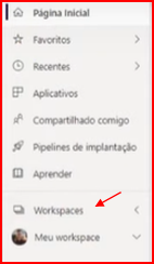
Go to PBI Service → Workspace → Refresh → Configure gateway.
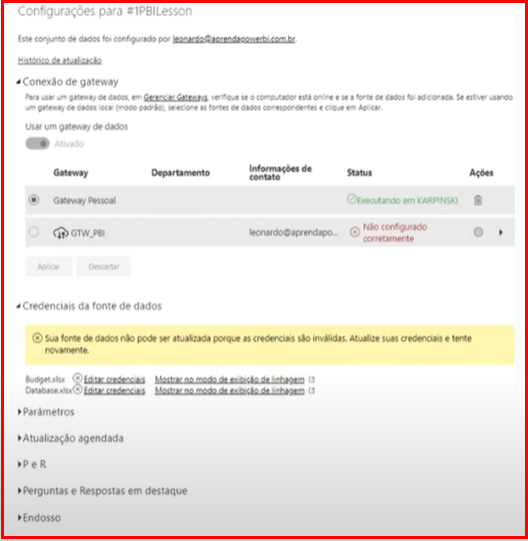
You have 2 options: personal gateway or standard gateway. Once you download the gateway, you allow the credentials to connect information from your database to the service.
Also, you can allow to automatically update the data. You can schedule the date and time.
An important note is that the Power BI Desktop is your development environment, and the Power BI Service is your visualization environment, so the main goal is to automatically update the Power BI Service Dataset.
And that’s it, guys! We just build our very first dashboard from ZERO! Hope you guys are excited to learn more Power BI!
See you next Thursday!
Cheers,
Leonardo.