This huge volume of data available around us needs to be digested by us every day. From the moment you wake up until the moment you go to bed, you are bombarded with information. The attention you give to each piece of information will depend on what you need at that moment and how that information is presented to you. The same happens when you give a presentation at your company – the one you spent days preparing.
Have you ever wondered how much of your presentation was actually absorbed by the audience? Of all those who attended your presentation, how many could stay immersed in it? If your presentation were a YouTube ad that appeared in those initial seconds, would you skip it or watch it until the end?
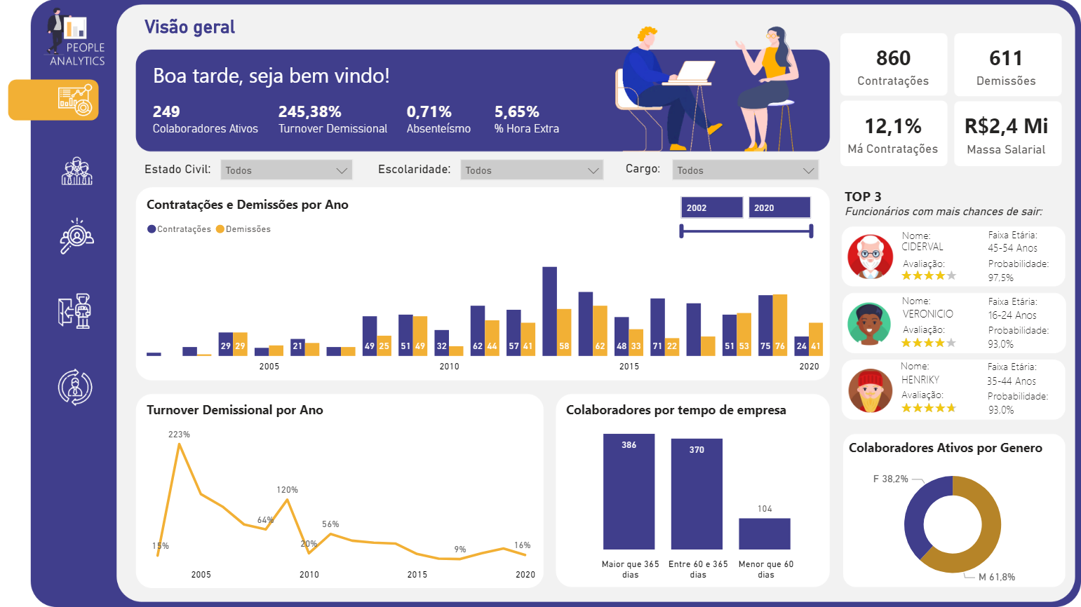
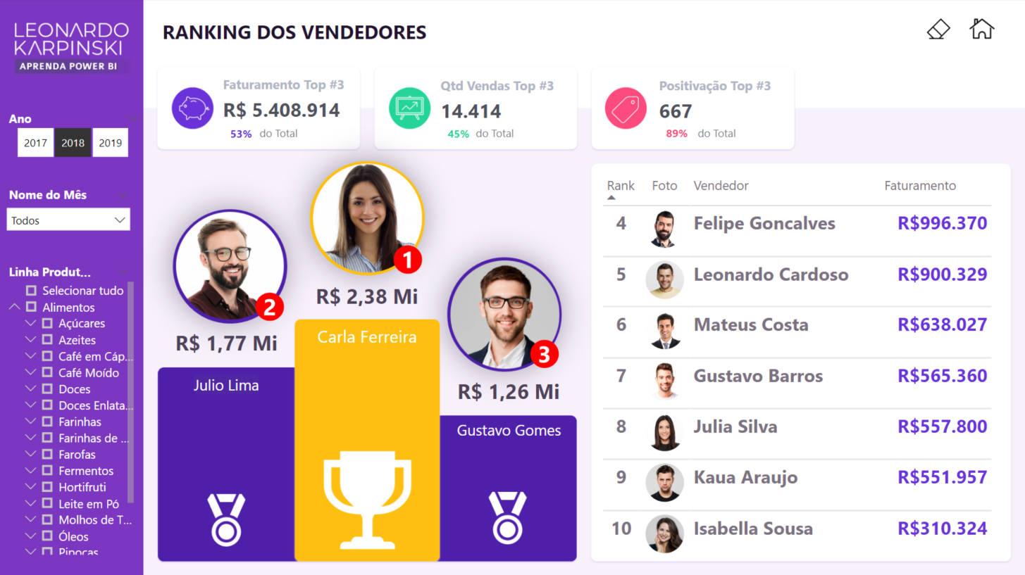
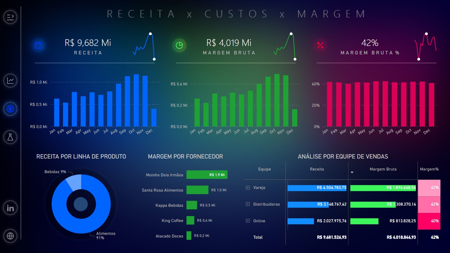
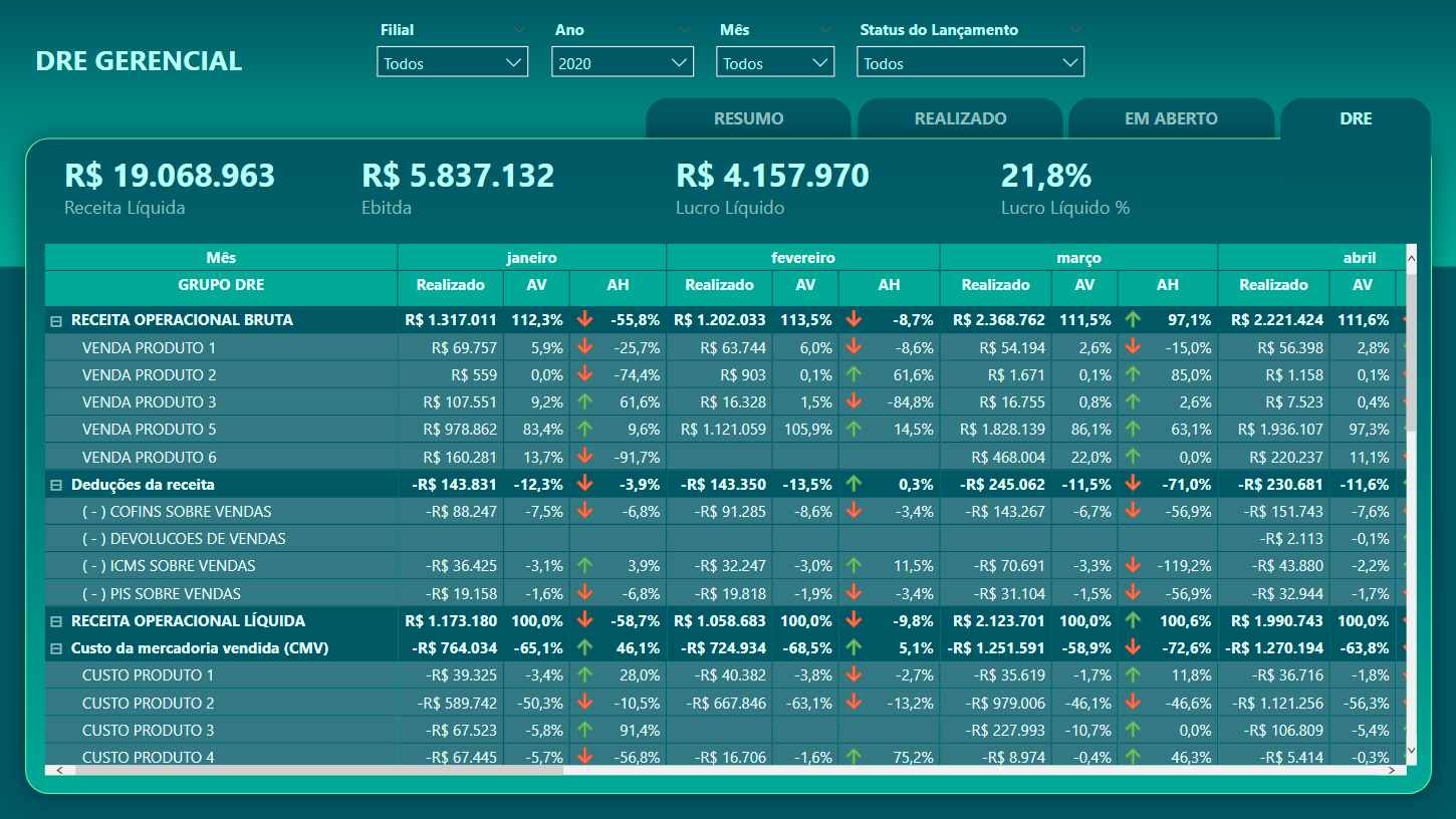
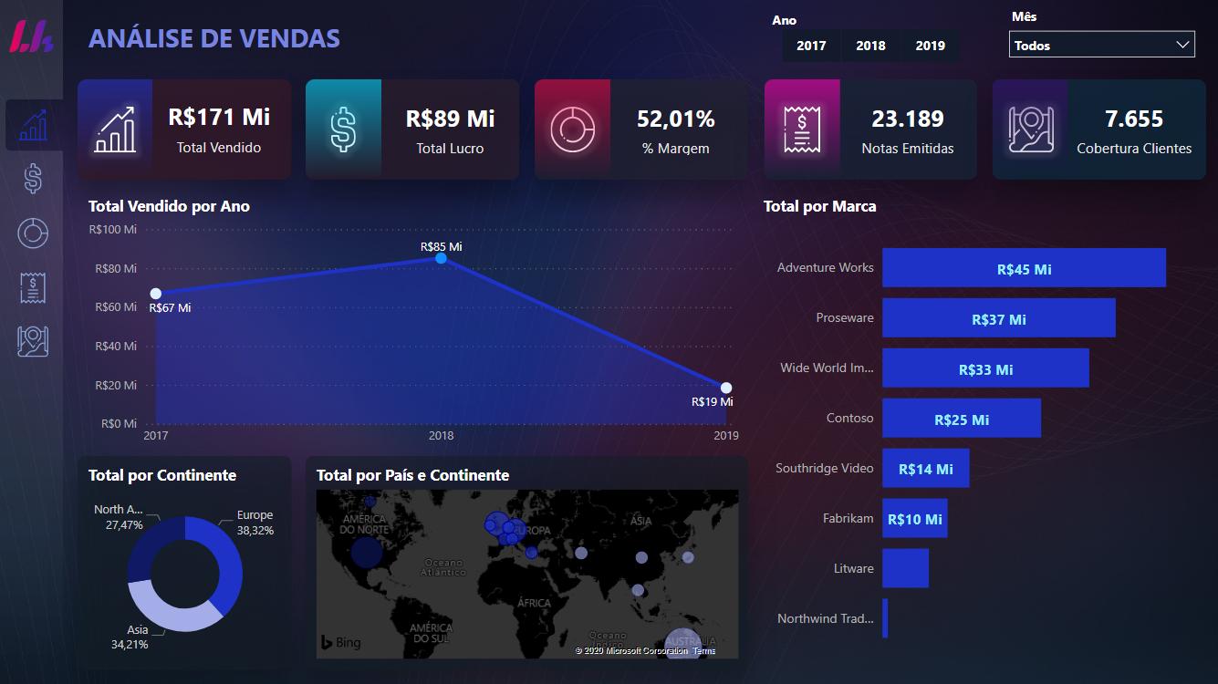
The same question arises with that report or presentation full of tables and charts you were asked to make. No matter the example, what we know is that if you don’t know how to tell and show a good story, a lot of work may have been in vain.
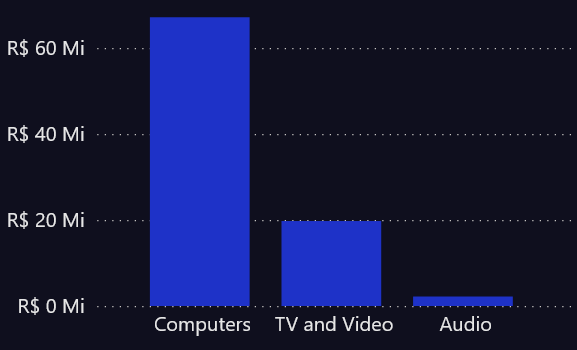
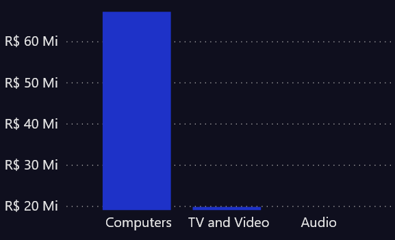
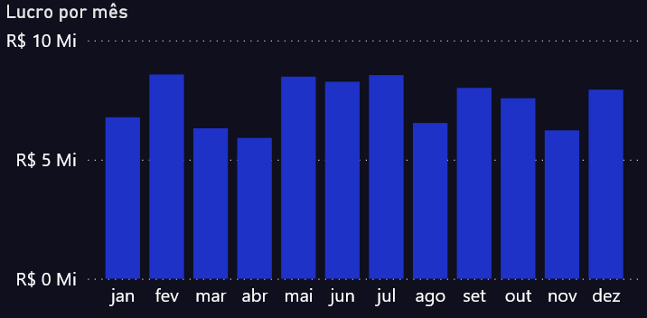
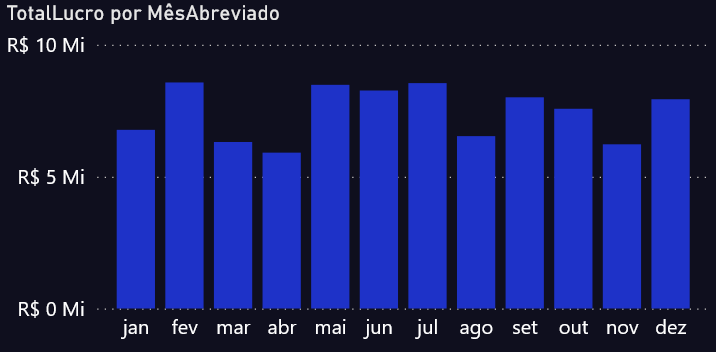
It may sound strange to talk about Storytelling in Power BI Dashboards since the information changes with each user interaction. Did you filter the period? The value changes, the story changes. Did you click on a point in the graph?! It changes again! Don’t worry about that. What you need to understand here is that you can (and should) use Storytelling resources in your BI projects. This can be summarized as follows: