Hi there! How are you?!
Today’s content will show you how to use some amazing visual features of Power BI ! We will give practical examples of how to use:
- Tooltip;
- Drill Down and
- Drill-Through
These three resources serve to provide extra information about something and detail its analysis.
Database
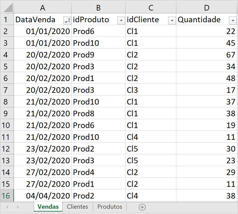
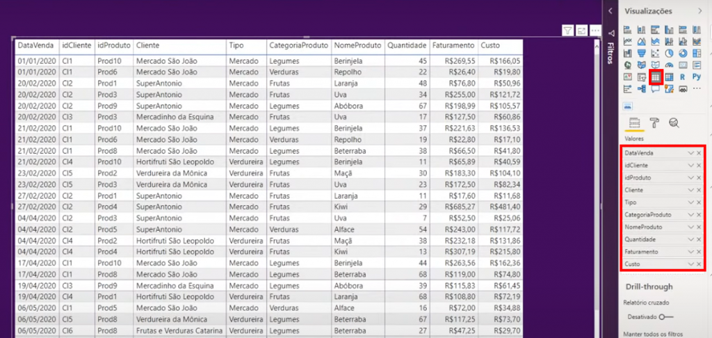
To exemplify the use of each of the resources I mentioned, I will use an Excel file with 3 tables: a fact table called “Vendas” and two dimension tables “Clientes” e “Produtos”.
The Sales table has all the sales events of each product.
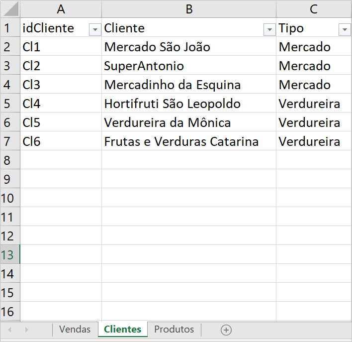
The customer table is the traditional one. It has the columns idCliente (unique code for each client, “Cliente” (name) e “Tipo” (classification).
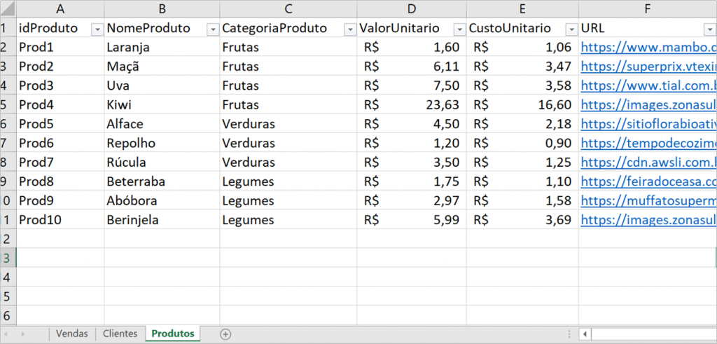
The “Produtos” table, beyond common columns (“Id”, “NomeProduto”, etc) will also have a column with the URL with the image of each product.
Now that I have presented all the tables we will use, just import them into Power BI, ok?!
Relationships
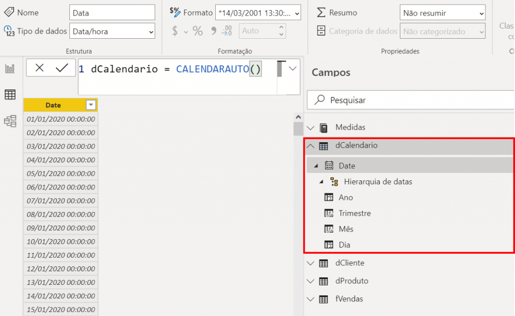
Well, since the database doesn’t have a date table, let’s create it in DAX:
dCalendario =CALENDARAUTO ()
See what created a table with the dates based on the maximum and minimum date was found (among all the tables we import). It was also created a hierarchy of “Ano”, “Trimestre”, “Mês” and “Dia” automatically.
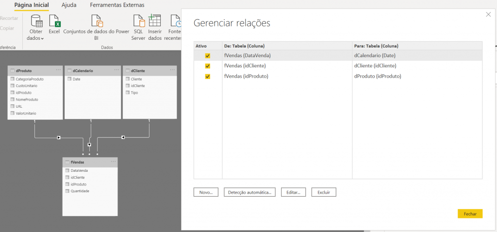
You can now create the relationship between the tables. The modeling is of the StarSchema type, see how the relationships turned out:
Drill Downs and Drill Up
Let’s calculate the invoicing with the sales? We will use a sum iterator function – the SUMX. The iterator functions have this “x” at the end..
Faturamento =SUMX (
fVendas,
fVendas[Quantidade]
* RELATED ( dProduto[ValorUnitario] )
)
By using SUMX you are making calculations row by row of the table. Then for each row you are multiplying the “valor unitário” by the “quantidade”. Note that “ValorUnitario” isn’t in the fact table (fVendas), but in the dimension table, so the RELATED function was also used so that you can use a value from another table “(Produto)” within the function SUMX. See that the first argument of SUMX is the table where you do the calculation: “fVendas”. Then the second argument is expected to be a column of the same table. When it is not, we need to use the RELATED function to “bring” this value to the “Vendas” table through the existing relationship “(IdProduto)” ?! How are we doing so far?!
Likewise, let’s calculate the “Custo”:
Custo =SUMX (
fVendas,
fVendas[Quantidade]
* RELATED ( dProduto[CustoUnitario] )
)
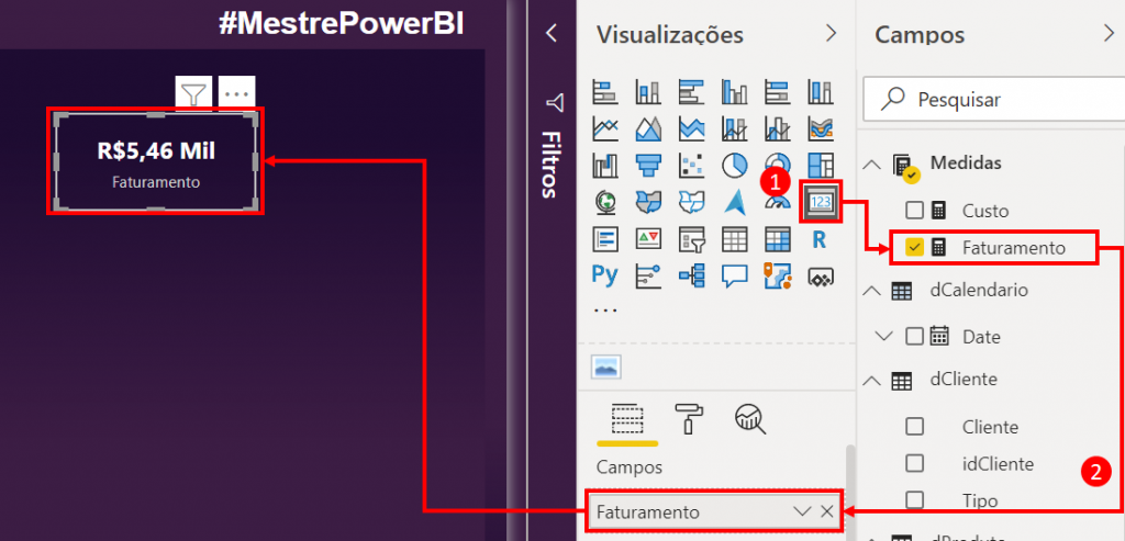
We will create two cards to represent the “faturamento” total and “custo”. To do this, simply select the “Card” visual and drag the measurement to “Campos”, look:
Repeat the same procedure to create the card with the “Custo”.
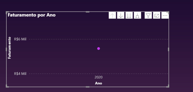
The next step will be to create an area graph to show the “Faturamento” over time. To do this, just select the “Area Graph” view and drag the “Faturamento” measure to the “Valores” field and Date to the Axis field.
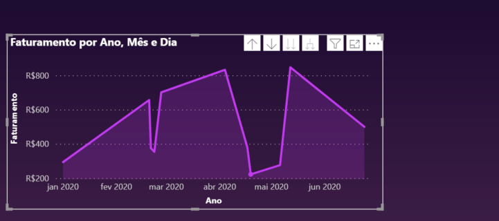
Remember that when we created the dCalendario table, it brought us not only our dates but a hierarchy? When we drag “Date” to the chart, we take the whole hierarchy along too. Drill Down will be responsible for navigating these hierarchies.
Tip:
Drill down: makes it possible to advance at different levels of a hierarchy and to detail the analysis within the same level, usually within the same dimension.
There are four buttons on top of the graph that allow this navigation between the hierarchies but there is a difference between them:
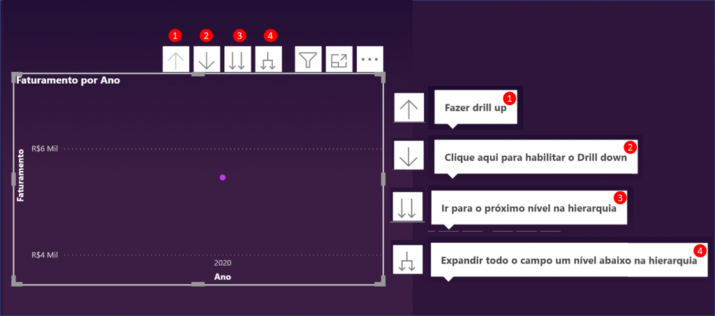
Let’s see what happens with the last button (the “little fork”):
Notice that the graph was showing more points as you navigated from the least granular to the most granular level (more detailed) in the hierarchy. So the first time I pressed the button, the axis showed beyond the “Ano”, the quarter. Then it advanced to “Mês” and then to “Dia”. The X axis showed these fields being “concatenated”. Briefly we advanced of level respecting the previous level.
The third button (double arrow down) no longer respects the previous level because it only shows the current level. Look:
See that when we arrived at the “dia” level, it was not shown in which month or quarter it is being considered, in other words, it does not consider the previous levels.

The last level advanced option is the second button (single down arrow). It is used to filter specific points on your chart. It asks you to select a point on the graph to advance the level at that specific point. As you do this, notice that your graph is being filtered and therefore may affect other visuals on your page – see that the value of the card changes when we advance in level.
Finally the first button (single arrow up). It just returns to the previous level (undoes the level advance you made). Look:
Pretty nice, huh? Let’s see the next resource!
Tooltip
Before we start, what it Tooltip ?
Tip:
Tooltip: allows you to display extra information that is relevant to the analysis, usually crossing information from other dimensions
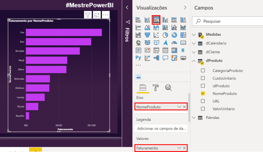
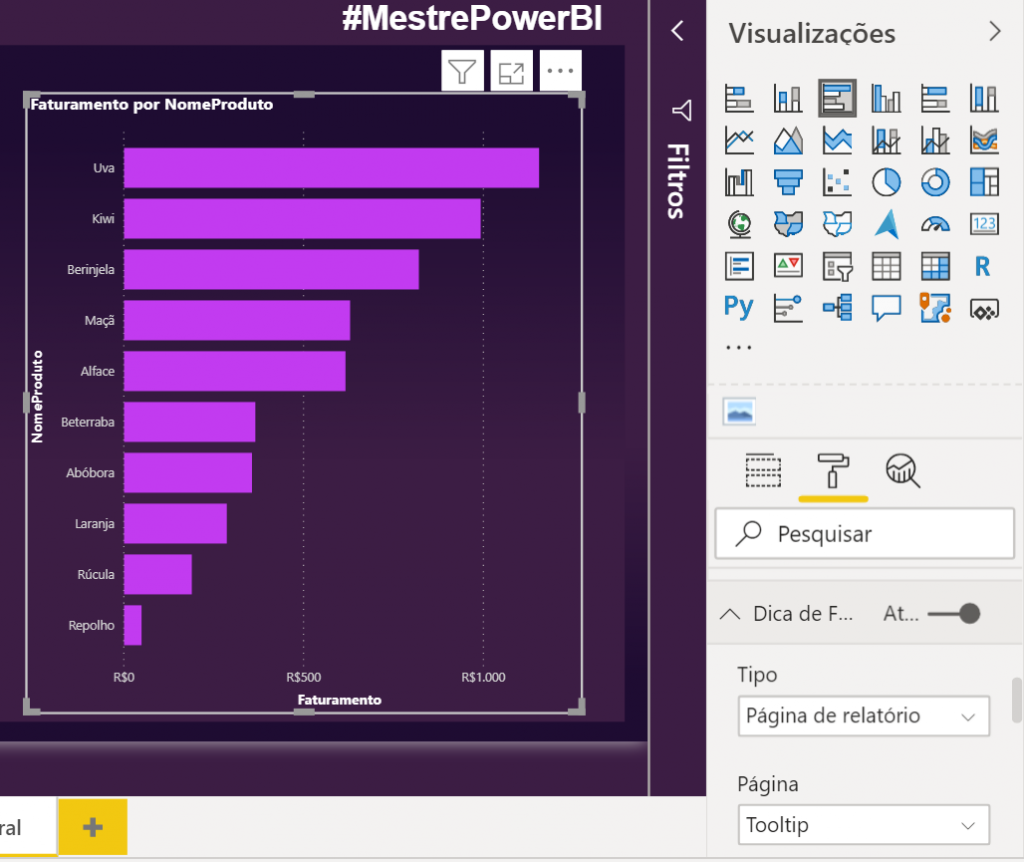
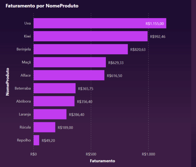
First, let’s create a vertical bar graph. To do this, just select the view Clustered Bar Chart and drag the measure “Faturamento” and the column “NomeProduto” to these fields:
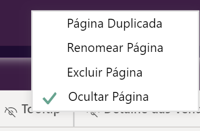
Now you will need a new page to use as Tooltip. Remember to right-click on the name of this page to leave it hidden because we don’t want the user of the report to get to it, ok?!
Now follow these stages:
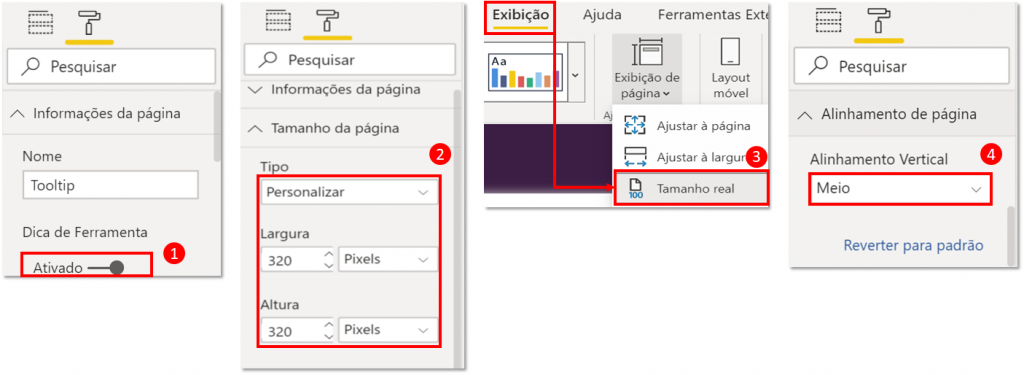
Stages:
1. In this new page you created, look for "Informações da Página" and activate "Dica de Ferramenta".
2. Look for "Tamanho da Página" and select "Tipo -Personalizar". Choose the desired width and height.
3. Go to the top menu of Power BI at "Exibição → Exibição da Página" and choose "Tamanho Real".
4. Go to "Alinhamento de Página" → "Alinhamento Vertical"→ Select "Meio"
Now we can start adding visuals to this Tooltip page.
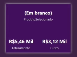
Let’s create a measurement to show the name of the selected product and add this measurement to a card.
ProdutoSelecionado =SELECTEDVALUE ( dProduto[NomeProduto] )
At last insert a card with “Faturamento”, “Custo” and “ProdutoSelecionado”.
You will need to return to the home page in visualizations that has the bar graph to bind this Tooltip to it, look:
Just search for “Dica de Ferramenta”, select “Página de Relatório” in “Tipo” and then select the page name containing the Tooltip you want to show.
By scrolling the mouse over each of the bars, you will be able to see the Tooltip:
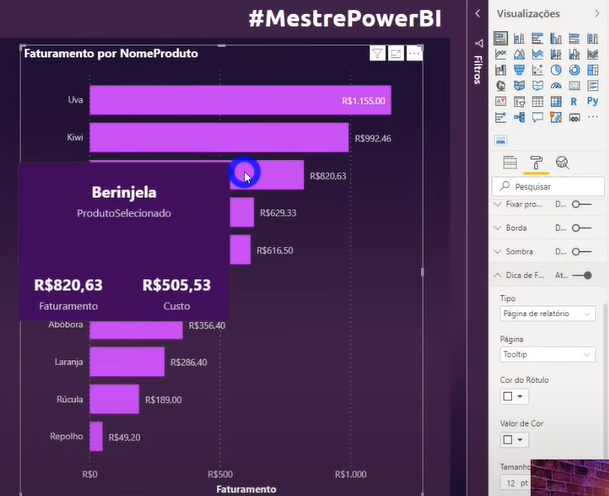
To make it even cooler, you can add an image to Tooltip. Remember that the “dProduto” table has a column with the URL? Nothing is by chance!
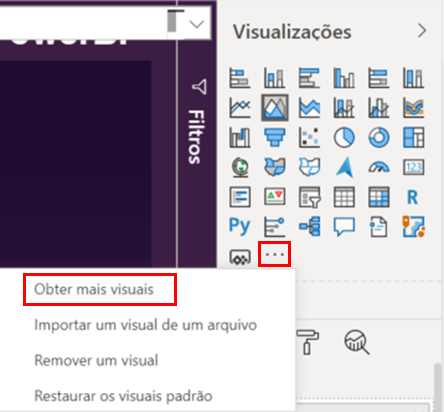
To do this you will need to import a custom visual (free) called Simple Image. Just go to these dots and click on “Obter mais visuais”. In the next window you search for “Simple Image” and add it.
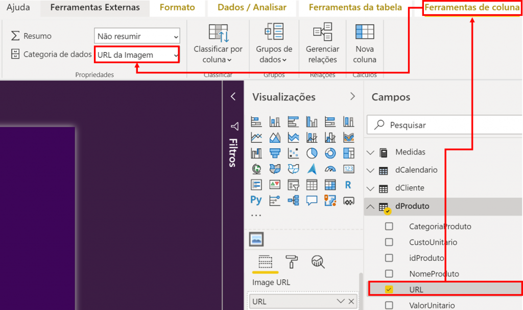
Before adding the URL column to the view, make sure it is categorized as “URL da Imagem”. If not, adjust it this way:
See how it looks:
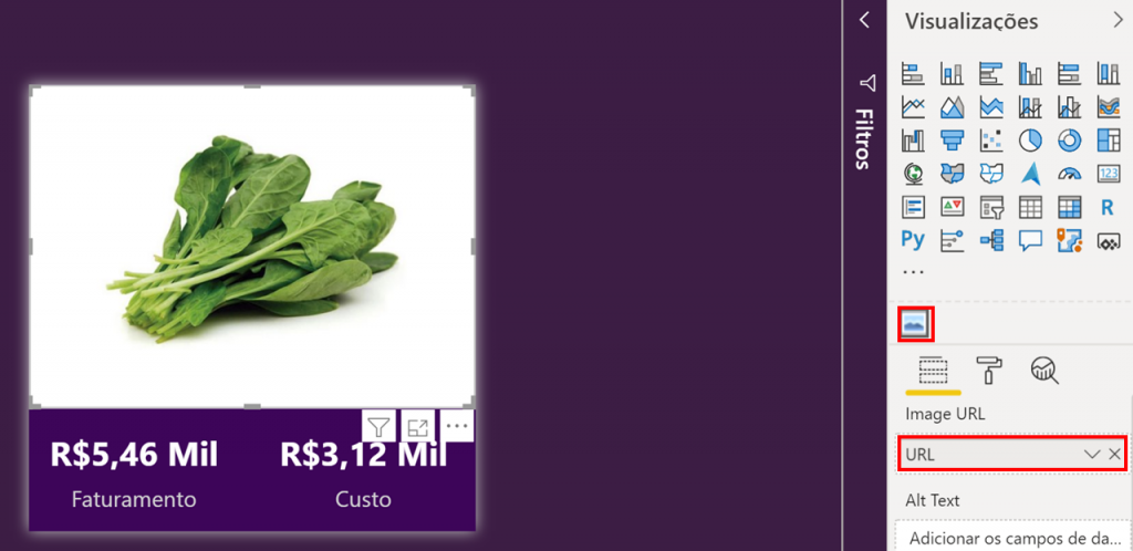
Done! Now see how spectacular the Tooltip result with the image:
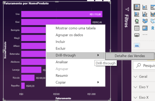
Drill-through

This tongue twister serves to show on another page details about a point in your report. It is different from Tooltip because this detail can only be seen on another page and you need to click some button to reach it.
Let’s create our detail page!
Create a new page and rename it to “Detalhe das Vendas”. Hide it (like we did with the Tooltip page). Add a table with the following fields:
We will also add the card with the name of the selected product and its image (similar to what we did with Tooltip), so if you prefer, you can even copy those two looks.
After that, you need to activate Drill-through by dragging the “NomeProduto” column into that blank space:
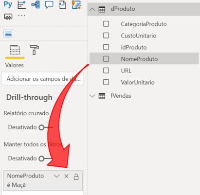
By doing this you will make it possible for the user to reach this page through any graphic that has the “NomeProduto” column. Note that by doing this, a back button has appeared on the top of the page
You may be wondering how the user will get to this page since there are no callsigns for this on the General page. The user will need to right-click on the item to get to Drill-Through. Look how it works:
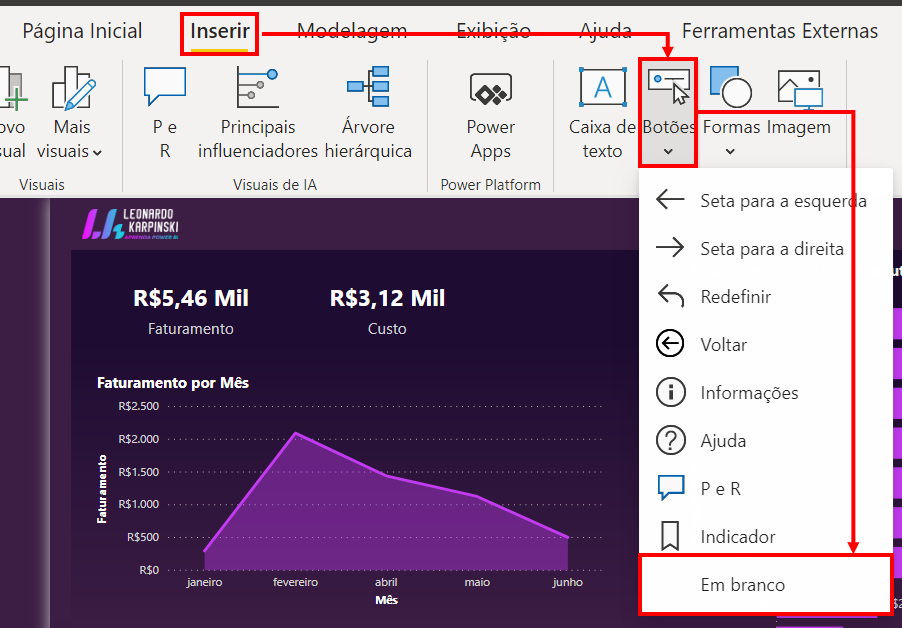
Many people complain about this feature because it is not intuitive for the user to do it, especially if he has no experience with Power BI reporting. So, we will create a button to help!
Go to the tool bar in “Inserir” → “Botões” → “Em branco”.
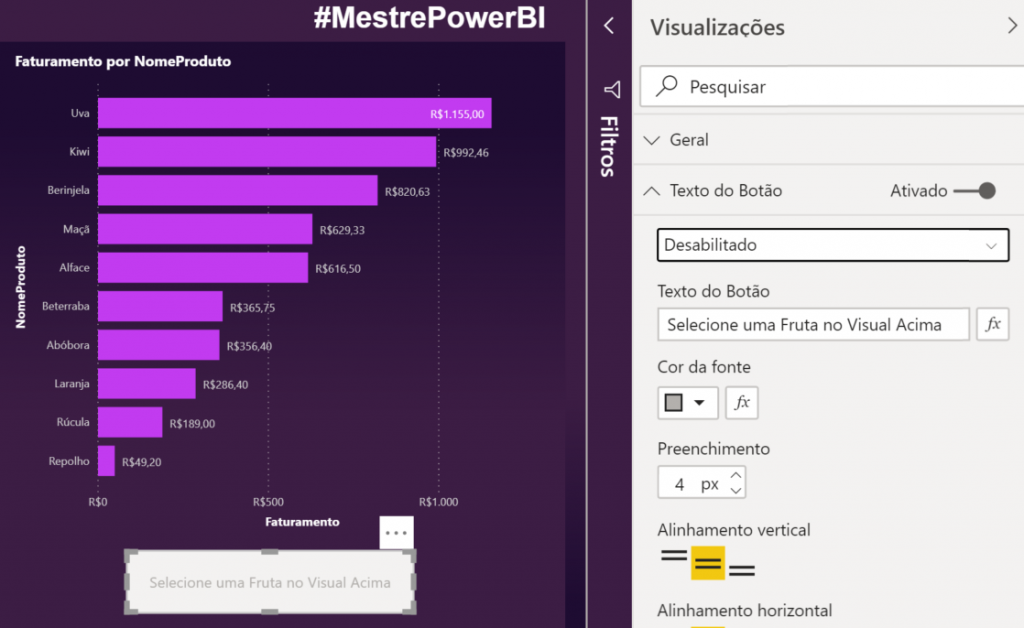
Note that Drill-Through only works if you select a point on the graph. So let’s make the button presents a text if you are without the selection of that point and another text when you have the selection. It looks complex but it’s not!
Edit the “Texto do Botão” and select “Desabilitado” in the Status dropdown of the button with “Selecione uma fruta no visual acima”.
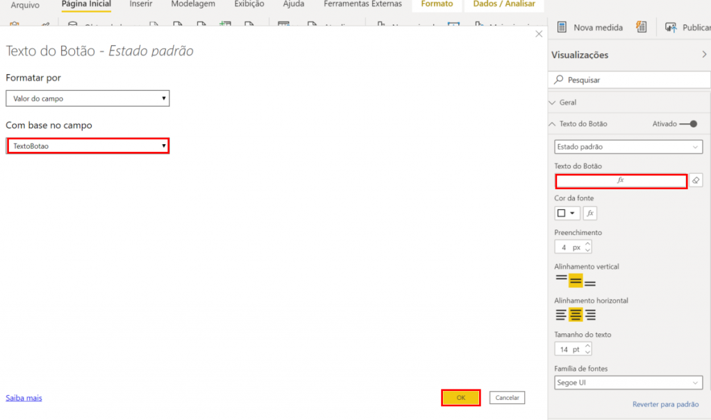
Now, create a new measuring to show the selection that was made by the user:
TextoBotao =“Detalhar Vendas de “
& SELECTEDVALUE ( dProduto[NomeProduto] )
See, See, the DAX formula above is quite simple! We only use the SELECTEDVALUE function to capture the name of the selected product (in the bar graph).
The ace in the hole will be add this measure to “Status Padrão”, look:
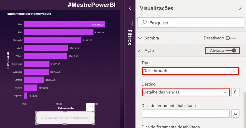
Finally, let’s add the command to be executed when the button is clicked. Search for “Ação” in the button settings and activate it. Then select Drill-Through and “Detalhe de Vendas”:
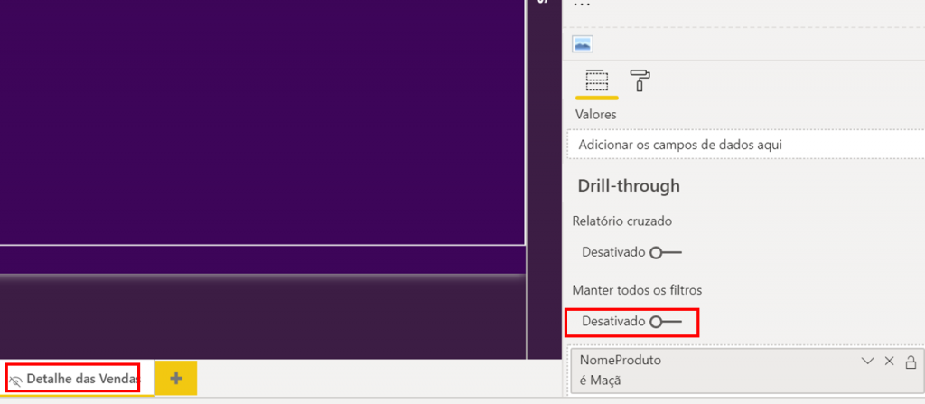
During Live #34, a participant asked how she could do so that the filters of other graphics were not considered when doing Drill-Through. Just uncheck this item:
During Live#34 I did some really cool dashboards in which I used Tooltips, Drill Down and Drill-Through in many ways and if you are curious you can take a look here.
Well, thanks for getting here. I hope you enjoyed it!
If you have any questions or suggestions for next lives leave your comment here below.
See you!

Cheers,
Leonardo.