Hi there! How are you?!
In today’s content, I’m going to share several tips to help you create amazing dashboards using Storytelling techniques in Power BI!
Before we begin, check out this article where I showcase some really cool dashboards for you to get inspired!

Click here to become a student of the most comprehensive Power BI course in the world and learn all the tips and secrets to deliver incredible dashboards.
But after all, what is Storytelling?
Humans have a natural ability to understand and listen to well-told stories. If you analyze those famous people who give speeches, you’ll notice they always start by telling a story right at the beginning of their talks—both to “break the ice” and to capture the audience’s attention. With reports and dashboards, it’s almost the same thing, although you can’t “narrate” this story verbally!
Contrary to what many think, you don’t need to be a designer to do good Storytelling! Obviously, you’ll need to study and seek good references, but keep in mind that it’s possible to create an amazing dashboard regardless of your background, okay?! I’m an engineer, for example! Nothing to do with design, right?!
Storytelling is the art of knowing how to tell “stories” with data in a fluid and organized way! Our goal is to make it easy for the target audience to read your page, report, dashboard, etc., and understand exactly the story you want to tell!
Shall we begin?!
Visual Placement
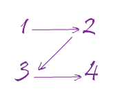
A cool tip I always follow is about the placement of visuals: always place the most important visuals at the top of the page! Users tend to scan a page following a “Z” pattern.
Tip: Without other triggers, users will start viewing the page at the top left of the screen, and that’s where you need to place the most valuable information on your panel! Then, their gaze will slide to the top right corner (2), then to the bottom left (3), and finally to the bottom right (4). Just imagine a “Z” (zigzag).
Recommendations
The main things I recommend are:
- Care about aesthetics
- Identify the user who will consume the data: you need to know their preferences
- Everything starts with the background and theme (color palette)
- Maintain consistency in colors, fonts, etc.
- Keep visuals aligned. Some people have OCD!
Choose the right visuals for each type of analysis. Have no idea how to do this? Take a look here.
In the link in item 6, you will see a guide on how to choose the correct visual according to the information you want to show. For example, if you want to compare various values, the visuals that fit this objective are these:
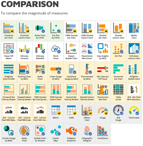
Source: https://www.sqlbi.com/wp-content/uploads/visuals-reference-sep2018-A3.pdf
With this in hand, you will have a better idea of which visual to use in each analysis.
Background
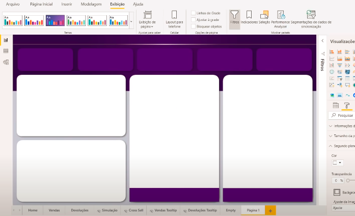
Basically, to create those background effects for visuals like the examples I showed, you’ll need a custom background for each page.
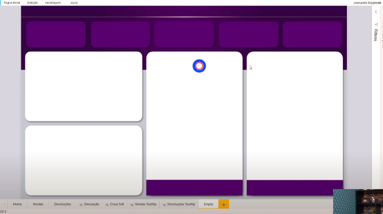
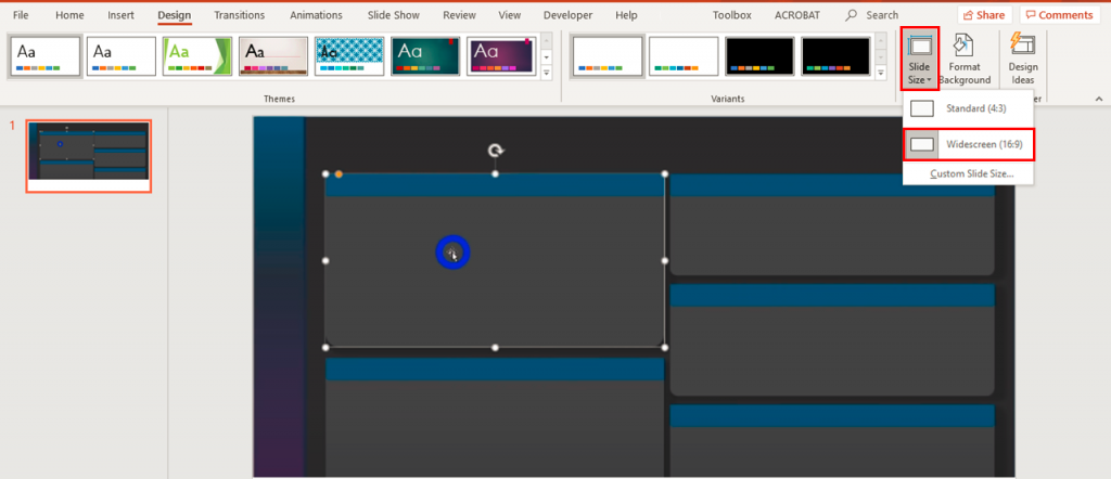
Now, get this: I do all of this in PowerPoint! Yes, you read that right! I insert each of these boxes in PowerPoint and arrange them until the entire page is filled. In the end, I select all the elements on the page by dragging the mouse over them and right-click to save them as a single image (as if taking a screenshot of the page I created). A student gave me a great tip: save the image as .SVG. This format ensures better resolution for your background. Oh, important: I use the standard Widescreen page size (16 x 9). Here’s an example:
Before inserting this background into Power BI, let’s do the following: enable the custom ribbon. This will be useful for working with templates. See how to enable it:
Steps:
(1) File → (2) Options and Settings → (3) Options → (4) Preview Features →  (5) Check Updated Ribbon → (6) Ok.
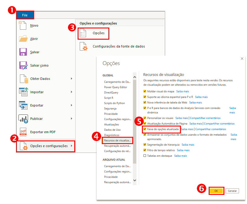
For this updated ribbon to appear, you must close and reopen Power BI Desktop.
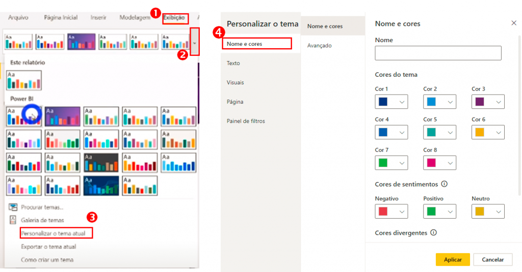
Now go to View to see options for changing the color palette, text settings, and other options:
Now let’s import that background into PBI.
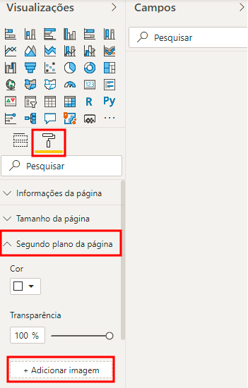
Formatting:
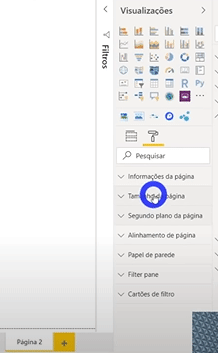
Click on the paint roller in Visualizations → Page Background → Add Image → In Transparency, change to 0% Transparency → In Image Fit, select Fit.
After doing this, we will have our background:
Adding Visuals
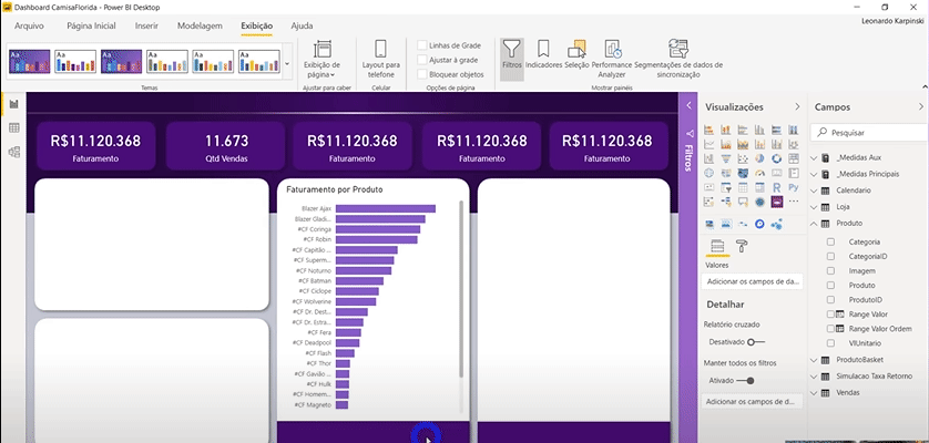
Now we can add our visuals in the spaces dedicated to each one, according to the background we created!
We’ll add the cards at the top of the page (remember the Z-tip?).
Just click on the Card visual, drag the field with our measure into it, and format the visual using that little paint roller.
Tip:
To save time formatting these cards, copy and paste the first card we made and just change the measure (field) in each one, okay?!
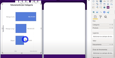
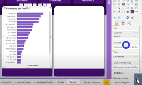
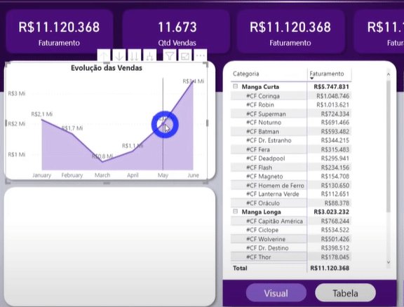
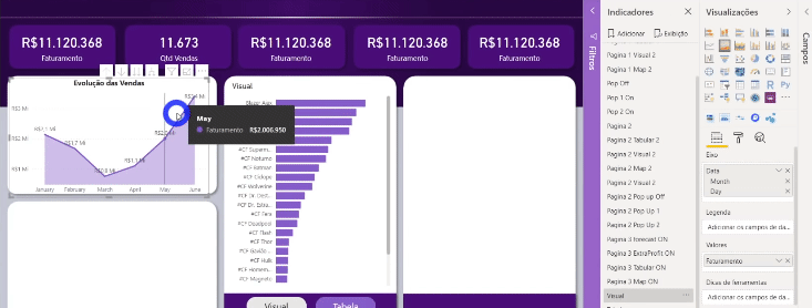
We’ll also add a vertical bar chart! Insert both the Category and Product fields to create a hierarchy in the visual and allow the user to use drill down/up in this visual. See:
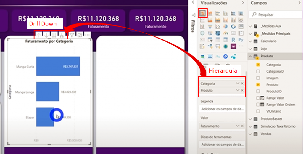
See how cool the drill down/drill up effect is on the bar chart!
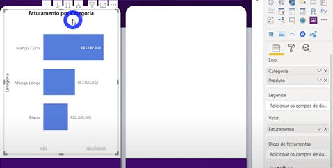
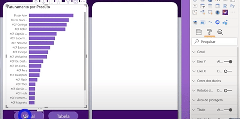
Notice that we have values both in the labels and on the X-Axis. Redundancy, right?! Let’s remove this X-Axis! Also, let’s turn off the Y-Axis Title (Category).
Tip:
Remove redundant information from your visuals! If you already have labels, for example, remove the axis that contains those values already present in the visual. Excess information (repeated) can confuse the user.
Adding Tooltips to Visuals
Let’s add images as Tooltips to that bar chart we just created! First, add a new page to your report. This entire page will be our Tooltip! Then change the settings:
Formatting:
Click on the paint roller in Visualizations → Page Size → In Type, select Tooltip → In Page Information, activate Tooltip and change the Name field (the page will automatically be renamed).
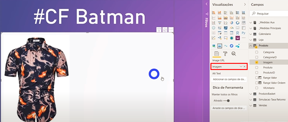
We’ll use a custom visual called Simple Image, which can be acquired for free from the Microsoft Marketplace. Here’s how to import it:
Oh, we added a Card containing the product name at the top of the page (it’s this #CF Batman).
Next step: configure the Simple Image visual. Imagine we have a column with the URLs of the images of all our products… We just need to drag this column into the Image URL. Easy!
Now, to add this page (Tooltip) to our bar chart, we need to do the following configuration on the bar chart:
Formatting:
Click the paint roller in Visualizations → Tooltip → Set Type to Report Page → Under Page, select the name you gave to the page that will serve as the Tooltip.
Creating Buttons
The next task will be to add buttons using bookmarks! The idea is to give the user two viewing options: graphical (e.g., bar chart) or tabular.
We’ll need two buttons: one to switch to table view and another to return to the chart.
With the new Power BI update, it’s pretty easy to add buttons to our pages! Check it out:
Steps:
Insert → Buttons → Blank → Format the background, text ("View") and borders following the step-by-step image (paint roller)
Repeat the same procedure, copying and pasting the already created button, for the button that will be named “Table.”
To change the color of these buttons when the user hovers over them, we also need to do the following:
Formatting:
Click the paint roller in Visualizations → Fill → Select On Hover → Change Fill Color.
Paint Roller → Outline → Select On Hover → Change Fill Color.
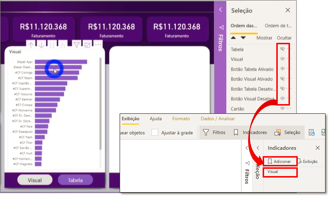
Now we’ll do something that will take some effort but will make our report even cooler! We’re going to make the button change color when selected, meaning if we click the View button, it should change color while the Table button remains the same. And vice versa!
The first step is to copy these two buttons and place them on top of themselves. Just click on each one, press CTRL+C and CTRL+V, and then position them exactly on top of the previous ones.
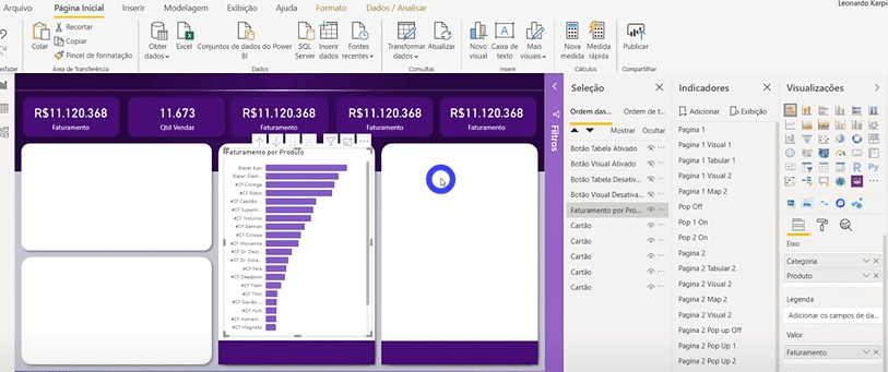
Go to View and click on Selection to open a selection settings panel.
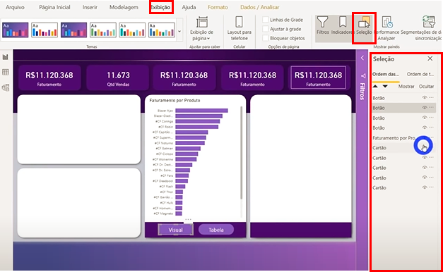
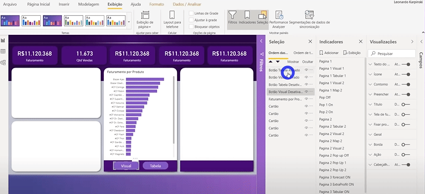
Now, you’ll notice that when you click on each item in this Selection panel, the corresponding visuals are selected. Let’s rename them so we don’t get lost, okay? To do this, simply double-click on each one!
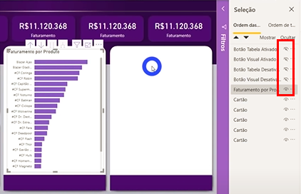
Remember that we have a button on top of another? Since we positioned them exactly on top of each other, let’s hide the buttons named “Activated” so that we can change the colors of the deactivated buttons to gray. Change the color for one of the buttons and copy the formatting to the other (as we did before) to save time! Check it out:
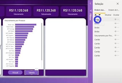
Click to hide all four buttons.
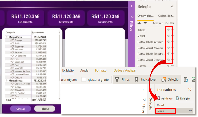
We need to create our table! To do this, copy and paste the bar chart and change it to a Matrix. Position the visual exactly in the same place as the bar chart (remember some people have OCD!). Rename the matrix and drag the bar chart below it in the Selection panel (for organization purposes). Finally, hide the table.
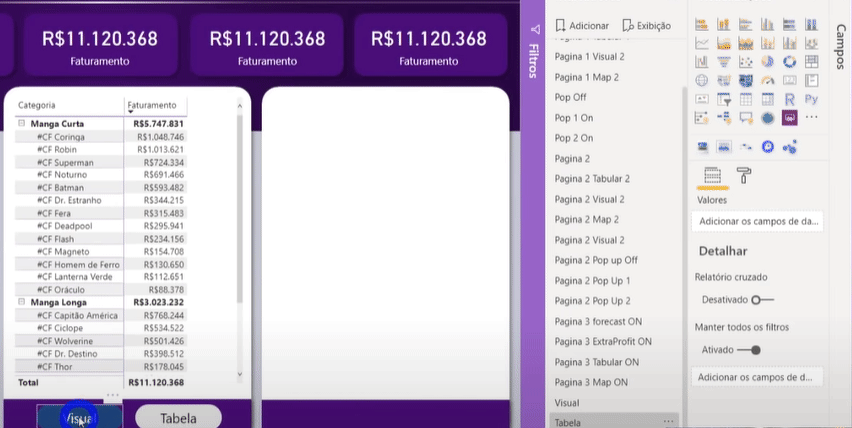
Now let’s play around with hiding and showing visuals to create our bookmarks. Leave only the View, Activated Table Button, and Deactivated View Button visible in the Selection panel. Then go to the Bookmarks panel and click Add. If the panel isn’t visible, enable it in the View tab (the same way you did with the Selection panel). We’re creating the Bookmark called View, see:
Now, we’ll follow the same procedure to create the Table bookmark.
There’s just one more thing: we need to configure each button to know what to do when clicked. In other words, we need to add this “action” to each button.
Formatting:
Click the paint roller in Visualizations → Enable the Action icon → Under Type, select Bookmark → Under Bookmark, select View.
Do the same for the Table button:
Formatting:
Click the paint roller in Visualizations → Enable the Action icon → Under Type, select Bookmark → Under Bookmark, select Table.
Oh, one very important thing! Note that if you select/filter a chart on a page that has buttons (made with bookmarks), the way we did, clicking one of the buttons will undo this filter. See what happens:
To prevent this from happening, change the bookmark property as follows:
Formatting:
Select the button → Bookmarks Panel → Right-click → Uncheck Data
Other Visuals
Now let’s show some other cool visuals I used in the Dashboard #CamisaFlorida.
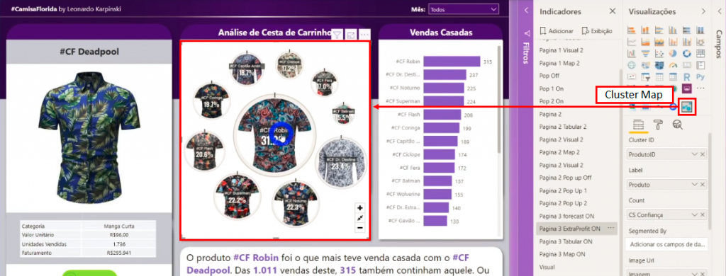
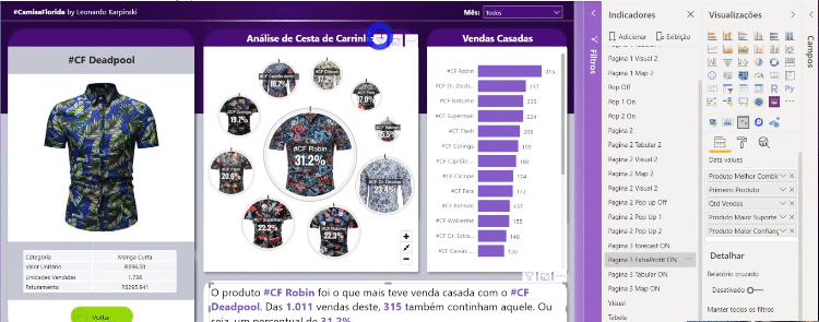
One visual I use to analyze cross-sell is the Cluster Map. The goal is to analyze the correlation between purchases, that is, to analyze the shopping cart basket of each purchase. On this page, I analyzed the sale of #CF Deadpool alongside the other shirts that were also purchased, and I could also view the respective confidence percentage alongside each image:
The Enlighten Data Story visual allows you to tell a story in a text box based on the values of your measures. Check out how cool it is:
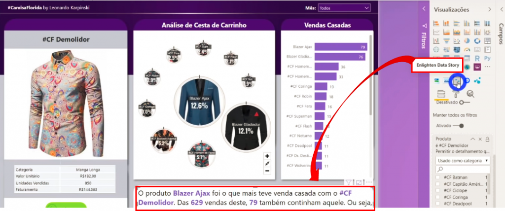
To configure it, just add the measures that will be mentioned in your text and write the default text. Note that the # symbols in this text will be replaced by your measures (in the order they are added). Each measure that appears in the text will be bolded. You can also format these measures to have a different color from the rest of the text. Take a look:
As this article was based on [Live #5 Mestre Power BI], some interesting questions from participants arose. Check them out:
In the product or related table, is there a URL associated with fetching the image? Is that all?
E., Celso.
That ‘s right, Celso! You need to have the URL in a column and map the data category to “Image URL”. For Simple Image, we don’t need it, but if we were using a table or another visual, we would probably need to.
Steps:
Column Tools → Data Category → Select "Image URL"
Leo, when it comes to panel colors, do you consider the company’s logo colors?
S., Eduardo.
Yes, I usually use the theme/company colors.
I’m having trouble generating the public link for the reports. Could it be because I don’t have Power BI Premium?
S., Flávio Henrique
You need to enable it in the Admin Portal, under tenant settings.
Well, folks, that’s all for today’s content! I hope you enjoyed it and found inspiration! See you next time!
Best regards,
Leonardo.