Hey guys, how are you?!
Today our post refers to Live #27 of the Master!!!
Before I start, I’d like to ask a few questions. Have you ever had problems with analysis used to compare current results with last year or other weeks? What about problems with analysis where you have to compare specific averages with the total? Or have you ever wondered what a cross sell analysis is?
I often receive questions on my social networks regarding these topics, and the subject for our Live #27!
So, stick around and follow up until the end that you will be good at these advanced DAX themes:
- YoY Analysis of Revenue and Margin (comparison between subsequent years)
- Cross sell
- Analysis among averages
Analysis: YoY Revenue
I will do an analysis evaluating the sales revenue measure of a certain company comparing the current year with the previous one.
| Tip: Remember that by “current” in Power BI depends on the evaluation context. Imagine that we have data from 2017 to 2019 in our database. And on the page where we will do the analysis we filter the year 2018. Then, our “current” context will be 2018. |
First, let’s create the Revenue measure:
Faturamento =SUMX ( fVendas, fVendas[QtdItens] * fVendas[ValorUnitario] )
Along with it we will make our first visual with invoicing by category and also a data segmentation per year:

Figure 1: Revenue Chart by Category

Figure 2: Data segmentation per year
Stages:
1. In "Visualizações" select "Tabela" → Format the space as image
2. In "Visualizações" select "Segmentações" → Format the space as image
We need 3 other measures to continue our analysis:
Faturamento LY =CALCULATE ( [Faturamento], SAMEPERIODLASTYEAR ( dCalendario[Data] ) )
Faturamento YoY =
[Faturamento] – [Faturamento LY]
Faturamento YoY % =
DIVIDE ( [Faturamento YoY], [Faturamento LY] )
The abbreviations LY and YoY, come from Last Year (previous year) and Year over Year (year over year).
A question….did you notice anything different in the 4 measures? Pay attention to the dividers used within the functions!
And then, do you understand? I am using “,” instead of “;”. This was an option that came in one of the last Power BI updates. And for those who follow me, they know that I intend to promote my work in other countries! So, I’ve already started to adapt. Thinking about the future…
Well, with these measures we have already made some progress with the analysis in our chart for the Year 2018:

Figure 3: Analysis Chart
Stages:
Add the new measures in the "Valores" space.
Scatter Plot
This is one I don’t use so much, but I started to focus on using it more often, because it helps a lot the user to understand and see the whole scenarios.
The first step is to create the graph with the information we already have:

Figure 4: Scatter Plot
Stages:
In "Visualizações" select "Gráfico de dispersão" → Format the space as image
It helps a lot if we put a parameter for the graphic subtitle that differs if the growth was high, low or negative, for example.
This is possible, but before we add this element to the view we need an auxiliary table with the limits of this parameter.

Figure 5: Creation of a segmentation chart
Stages:
In "Página Inicial" select "Inserir dados" → Fill in the table
| Important: When using limits in measures you have to be very careful where you are going to use smaller (<), larger (>) and equal (=). A lot of people make this mistake and complicate once you have to calculate the measurement. |
The next measure we will create is the one that makes the calculation of the segmented revenue by our growth parameter:
Faturamento por Categoria =CALCULATE (
[Faturamento],
FILTER (
VALUES ( dCliente[Categoria] ),
[Faturamento YoY %] >= MIN ( SegmentoCrescimento[LimInf] )
&& [Faturamento YoY %] < MAX ( SegmentoCrescimento[LimSup] )
)
)
Along with it we have the dynamic segmentation of the revenue per growth! Let’s see if it works!? For that I will create a visual with the segmentation chart and with the revenue measures data with and without the filter:

Figure 6: Chart with growth analysis
Stages:
1. Create the Revenue measure by Category
2. In "Visualizações" select "Tabela" → Set up the space according to the image
See that if we don’t apply the filter to create this virtual relationship in the measure the revenue calculation doesn’t comprehend the growth context!
By doing so, we can improve our scatter plot by changing the X-axis measurement and adding the legend:

Figure 7: Scatterplot Change
Another cool design that helps you understand the revenue is the stacked bar chart! Let’s create it as follows:

Figure 8: Stacked bar chart
To visualize the representation of our turnover by category and growth type, we will create a clustered column chart:

Figure 9: Clustered column chart
Stages:
1. In "Visualizações" select "Gráfico de dispersão" → Set up the space according to the image
2. In "Visualizações" select "Gráfico de barras empilhado" → Set up the space according to the image
2. In "Visualizações" select "Gráfico de colunas clusterizado" → Set up the space according to the image
Besides, imagine that the user wants a quickly view only the negative categories. What could we do to build this into our design!? If you answered data/filter segmentation, you got it right! Let’s put it together:

Figure 10: Data segmentation per growth
Stage:
1. In "Visualizações" select "Segmentação de dados" → Set up the space according to the image
I told you this classification is dynamic! Well, and then you can ask “Leo, why is this classification dynamic!? I answer you! Because if you add filters and change contexts on the page the visuals will interact with this new definition! So, it’s not static….
For example, we will apply a filter for the “Sugar” group on the page:

Figure 11: “Sugar” group segmentation

Figure 12: Result of the applied filter
Stages:
1. In "Visualizações" select "Segmentação de dados" → Set up the space according to the image → Select "Açúcar"
2. Show results variation
See how much the stacked bar chart values have changed!
To finish our page, we will place a card indicating our summarized revenue variation:

Figure 13: Multiple-line card
Stage:
In "Visualizações" select "Multiple-line card" → Set up the space according to the image
The result of our first page of YoY revenue analysis looks like this:

Figure 14: Final YoY Revenue Page
Analysis: YoY Margin
Looking only at the revenue can deceive about the company financial health. The margin analysis, comes to add information about the business. So, in a new page we will make this analysis!
We will need our cost to calculate the margin. The cost comes from the chart “fVendas” and depends on the unit cost of the product and how many units were sold, thus being our measure:
Custo =SUMX ( fVendas, fVendas[Custo Unitário] * fVendas[QtdItens] )
And our margin measurement is tied to our revenue and our cost:
Margem =[Faturamento] – [Custo]
And to calculate the previous year’s margin, just use the SAMEPERIODLASTYEAR:
Margem LY =CALCULATE ( [Margem], SAMEPERIODLASTYEAR ( dCalendario[Data] ) )
With both, we can calculate the variation:
Margem YoY =[Margem] – [Margem LY]
We will start to analyze with the table design. With it, we will understand by category how much we improved or worsened in relation to the previous year (remember that the filter of the year is for 2018):

Figure 15: Margin analysis chart
Stage:
In "Visualizações" select "Tabela" → Set up the space according to the image
We already see that we have worsened the margin, even having a bigger revenue (Revenue 2018 = $ 10,214,809, 41/Revenue 2017 = $ 6,648,222,05/Increase of = 53,65 %).
Well, imagine you have presented this result to your manager, and he started to get worried. And now what? How to help him understands this information!? Remember the scatter splot? It is a great tool to kind of situation
The first step is to create a scatter plot with the information of variation of margin and revenue variation by category:

Figura 1e: Scatter plot chart
Stage:
In "Visualizações" select "Gráfico de dispersão" → Set up the space according to the image
Well, with this chart you can better understand the analysis!? Difficult, right!? We still have how to improve and a lot…. the second step is to divide this chart in 4 quadrants:
- 1 – Positive Margin and Positive Revenue;
- 2 – Negative Margin and Positive Revenue;
- 3 – Negative Margin and Negative Revenue;
- 4 – Positive Margin and Negative Revenue.
To make this division in the chart, we use the help of “Analysis” …. is that magnifying glass button next to the format roll:

Figure 17: Adding lines to create quadrants
Stages:
1. In "Análise" select "Linha Constante do Eixo X" → Valor = 0
2. In "Análise" select "Linha Constante do Eixo Y" → Valor = 0
Creating lines, that’s our chart:

Figure 18: Scatter plot with quadrants
This way, we already have a much better idea of where we should analyze in more detail. Imagine that we can create a filter that makes the segmentation of these quadrants. It would help, right? Yes, and I say more… let’s do it. Let’s create a segmentation chart with the limits:

Figure 19: Segmentation chart
Stage:
In "Página Inicial" select "Inserir dados" → Fill chart as image
| Important: Whenever you create segmentation charts, enter in managing relationships to analyze if Power BI didn’t automatically create relationships for this new chart. |
Let’s delete a relationship that Power BI automatically made between this and the other segmentation table:

Figure 20: Deleting relationship
Stage:
In "Modelagem" select "Gerenciar relações" → "Excluir relação" between table
Remember how we managed to use this kind of segmentation for invoicing!? We had to put these limits within a measure for Power BI to apply context to each line. So, here we will do something very similar:
Margem YoY por Categoria =CALCULATE (
[Margem YoY],
FILTER (
VALUES ( dCliente[Categoria] ),
[Faturamento YoY] >= MIN ( SegmentoMC[LimInfFat] )
&& [Faturamento YoY] < MAX ( SegmentoMC[LimISupFat] )
&& [Margem YoY] >= MIN ( SegmentoMC[LimInfMC] )
&& [Margem YoY] < MAX ( SegmentoMC[LimSupMC] )
)
)
| Important: Limits are applied and associated only for “Category” of the client! If you want to create this analysis for customer table information, you must change the VALUES part of the measurement. |
With this measurement, we change the fields of our scatter plot by adding the subtitle with quadrant and changing the x-axis measurement:

Figure 21: Updated scatter plot
Stage:
Add "Legenda" and update "Eixo X"
And we will also create 3 visuals to provide the user with information to analyze customer categories and products with low margin and have a data segmentation per quadrant:

Figure 22: Stacked bar chart

Figure 23: Waterfall Chart

Figure 24: Quadrant Filter
Stages:
1. In "Visualizações" select "Gráfico de barras empilhado" → Set up the space according to the image
2. In "Visualizações" select "Gráfico de cascata" → Set up the space according to the image
3. In "Visualizações" select "Segmentação de dados" → Set up the space according to the image
With the visuals ready, we have our YoY margin analysis page ready, which looks like this:

Figure 25: YoY Margin Page
Cross sell
Cross-sell analysis is well known for retail and distribution people. I don’t know if you know that story of an American market that analyzed its sales and realized that on Fridays the quantity of beer and diaper shopping on the same purchase was high. This happened because normally the parents who were going to buy the diapers already took the opportunity to take the weekend beer home. This is a very classic example of Market Basket Analysis, and it helps users a lot to try to understand their sales.
The idea here is to quantify how many customers have bought a certain product A (e.g. beer) and also bought product B (e.g. diaper).
The first step is to create the measurement for counting customers:
Clientes =DISTINCTCOUNT ( fVendas[cdCliente] )
And make this count by group in a table view:

Figure 26: Products and quantity table
Good, here we have the information we need (product and quantity). However, we need the duplicate product information! Think with me, you will be analyzing a product on one side in a chart and this has to be related (so two charts) with another product in another chart.
You can create this chart virtually, but here we will duplicate the chart “dProduto” in Power Query:

Figure 27: Duplicating the product chart
Stapes:
1. In "Página inicial" select "Transformar dados"
2. Right-click on the table dProduto → Click on "Duplicar" e rename
With the duplicate table, we can close and apply to return to the Power BI desktop.
Remember what I said back there about what can happen when we create new chart in the project? Power BI can create relationships automatically! In this case, it created the relationship between the original product chart and the copy. We will need this relationship, however we will leave it inactive:

Figure 27: Disabling the relationship between the charts
Stage:
In "Modelagem" select "Gerenciar relações" → Disable relationship
To calculate the customers who bought both from the group selected in the first data segmentation (Grupo – dProduto) and in the second data segmentation (Grupo 1 – dProdAux1) we use the intersection between them. For this we will create a measure using INTERSECT:
Clientes Cross =VAR vClientes0 =
VALUES ( fVendas[cdCliente] )
VAR vClientes1 =
CALCULATETABLE (
VALUES ( fVendas[cdCliente] ),
ALL ( dProduto ),
USERELATIONSHIP ( dProdutoAux1[cdProduto], fVendas[cdProduto] )
)
VAR vInt =
INTERSECT ( vClientes0, vClientes1 )
RETURN
COUNTROWS ( vInt )
We will apply two data segmentations on the page (Açucares to Grupo and Farinha de Trigo to Grupo 1) and check the cross sell result for this analysis:

Figure 28: Two group segmentation visuals

Figure 29: Result chart with the applied filters
Stages:
1. Inm "Visualizações" select "Segmentação de dados" → Create 2 filters for page Grupo - dProduto and Grupo 1 - dProdutoAux1
2. In "Visualizações" select "Segmentação de dados" → Set up according to the image
Having the measures of quantity of customers who bought the product and also the cross sell. There is a way to evaluate the percentage relation between them with a measure. This measure is called “Confiança” (nomenclature used in statistics).
Confiança =DIVIDE ( [Clientes Cross], [Clientes] )
And with it we build our matrix visual:

Figure 30: Cross sell matrix (confiança)
Stage:
In "Visualizações" select "Matriz" → Set up according to the image - attention to the correct use of the group spaces of each table
To leave a more intelligible visual to our user, we can build a heat map on the matrix:

Figure 31: Conditional formatting of the “Confiança” field
Stage:
In "Valores" click on the cursor in the right of "Confiança" → Select "Formatação condicional" → Select "Cor da tela de fundo" → Fill in the spaces according to the image

Figure 32: Matrix result with Heat Map
So, what do you think of the visual? Did you notice that when the line is equal to the column (“Açúcar” x “Açúcar”, “Óleo x Óleo”, etc…) the values are 100% and that gives a “polluted” visual? We can change the measure of “Confiança” so that the return is empty in these cases, greatly improving the visual:
Confiança =IF (
SELECTEDVALUE ( dProduto[Grupo] ) <> SELECTEDVALUE ( dProdutoAux1[Grupo] ),
DIVIDE ( [Clientes Cross], [Clientes] )
)

Figure 33: Visual after changing the “Confiança” measure
It’s getting pretty, huh?
Well, now imagine that instead of analyzing 2 products you have 3. This was a question of one of our students in the Telegram group when I was setting up Live #27, and that makes more complicated to calculate.
To do this, we will create another copy chart of dProdutos in Power Query:

Figure 34: New copy of dProduto (dProdAux2)
Disable the relationship between dProduto and this copy:

Figure 35: Desabling relationship
And now, we need to add in our measure a new intersection which is the result of the first intersection with this second calculated column:
Clientes Cross =VAR vClientes0 =
VALUES ( fVendas[cdCliente] )
VAR vClientes1 =
CALCULATETABLE (
VALUES ( fVendas[cdCliente] ),
ALL ( dProduto ),
USERELATIONSHIP ( dProdutoAux1[cdProduto], fVendas[cdProduto] )
)
VAR vClientes2 =
CALCULATETABLE (
VALUES ( fVendas[cdCliente] ),
ALL ( dProduto ),
USERELATIONSHIP ( dProdutoAux2[cdProduto], fVendas[cdProduto] )
)
VAR vInt01 =
INTERSECT ( vClientes0, vClientes1 )
VAR vInt12 =
INTERSECT ( vInt01, vClientes2 )
RETURN
COUNTROWS ( vInt12 )
That’s it! With this we can apply 3 filters on the page (Grupo – dProduto, Grupo 1 – dProdAux1 and Grupo 2 – dProdAux2) that our visuals will work for this context:

Figure 36: Page data segmentation
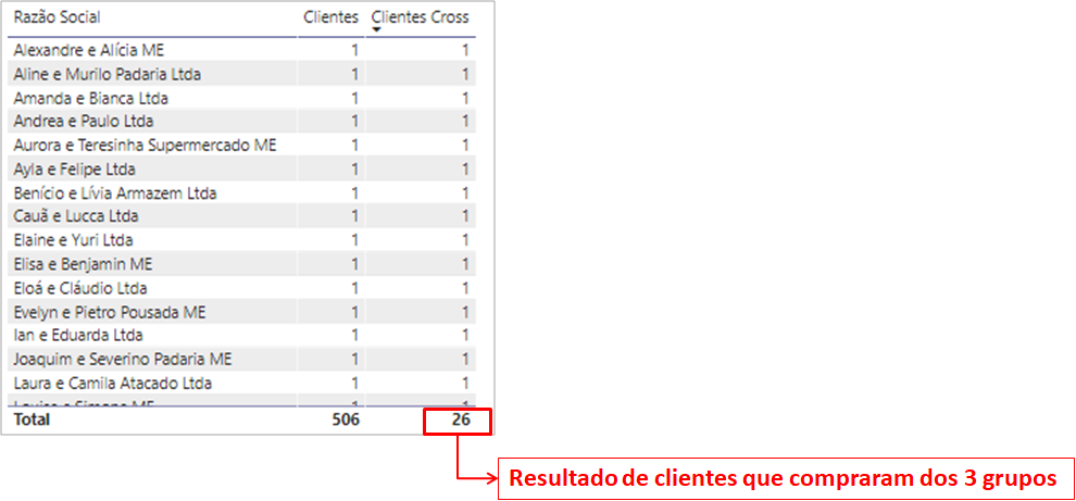
Figure 37: Result of applied filter
Stages:
1. Create another segmentation on the page → Grupo2 - dProdAux2
Average per category
This is an interesting analysis to evaluate how one or some categories behave compared to the total.
As it is a comparison, we have to create two measures. The first one will be the average revenue per client, considering filters applied if the user wants to evaluate some specific group. And the second, the average revenue of all clients (disregarding any filter applied to visuals) that we use ALL to disregard applied contexts.
Fat Médio por Cliente =AVERAGEX ( VALUES ( dCliente[cdCliente] ), [Faturamento] )
Fat Médio por Todos Cliente =
CALCULATE ( [Fat Médio por Cliente], ALL ( dCliente ) )
And starting from them, we will create 3 visuals:
- Data segmentation: for the user to choose which category to analyze
- Chart: with the group and the two measures to show the values
- Column and Row Graph: to analyze how the variation in the result of the selected category with the total mean was

Figure 38: Data segmentation

Figure 39: Comparison Chart

Figure 40: Column and row chart
And the result with the applied filter (bakery, in the example) looks like this:

Figure 41: Page result with applied filter
Stages:
1. In "Visualizações" select "Segmentação de dados" → Set up the fields according to the image
2. In "Visualizações" select "Tabela" → Set up the fields according to the image
3. In "Visualizações" select "Gráfico de colunas e linha" → Set up the fields according to the image
Analysis per Week
People often ask me and ask questions about week time analysis. This is not the kind of analysis that is so complicated if you use a counter for the weeks in your dCalendario. Working with this counter makes it much easier to do those analyses when it turns a year (for example, from week 52 to week 1).
We will build this counter in 2 steps. First we will create the number of the week in our dCalendario and then by mathematical logic we can create the counter:

Figure 42: Creating a new column
Semana do Ano =WEEKNUM ( dCalendario[Data] )
Contador Semana =
( dCalendario[Ano] – 2017 ) * 53 + dCalendario[Semana do Ano]

Figure 43: Result of dCalendario with the two columns
Stage:
1. In "Dados" select the chart "dCalendario" → In "Ferramentas de coluna" select "Nova coluna"
2. Use the DAX formula for "Semana do Ano"
3. Repeat step 1
4. Use the DAX formula for "Contador Semana"
With this column to help, we were able to create our comparative measures for the “Faturamento da Semana Passada” (LW Revenue) and the last “Faturamento de 4 semanas” (Average 4W Revenue):
Faturamento LW =CALCULATE (
[Faturamento],
FILTER (
ALL ( dCalendario ),
dCalendario[Contador Semana]
= MAX ( dCalendario[Contador Semana] ) – 1
)
)
Fat Médio 4W =
VAR vSemanaContexto =
MAX ( dCalendario[Contador Semana] )
RETURN
CALCULATE (
[Faturamento]
/ CALCULATE ( DISTINCTCOUNT ( dCalendario[Contador Semana] ), fVendas ),
FILTER (
ALL ( dCalendario ),
dCalendario[Contador Semana] <= vSemanaContexto
&& dCalendario[Contador Semana] > vSemanaContexto – 4
)
)

Figure 44: Revenue Analysis, LW Revenue and 4W Revenue
Stages:
1. Create measures of "Faturamento LW" and "Fat Médio 4W"
2. In "Visualizações" select "Matriz" → Set up fields according to the image
Well, guys, that was our Live #27 content!! A lot of what I did here were questions and suggestions from the people in the social networks. So, I hope it helped you to understand these analyses that are at a more advanced level of DAX. If you have any questions or suggestions for the next Lives topics, you already know, you can leave them in the comments.
Cheers,
Leonardo.