
Hey guys! How is everything going?! Today we are going to talk about an advanced topic in DAX that may help you with several insights about your client’s portfolio. Our goal is to segment customers according to the last purchase date, frequency, and monetary value.
We know that new customer acquisition is important for the growth of any company. However, maintaining current customers tends to be cheaper and more profitable. Therefore, managing a customer portfolio is essential.
Among the opportunities I like most for the RFM matrix, we have:
- Better categorize your customers;
- Understand where the business is evolving to;
- Identify the frequency of customer purchase;
- Improve predictability;
- Compose an adhering strategy of recurrence in sales
- Categorize the customer portfolio according to purchases volume – ABC curve;
- Establish sales targets by customer;
- Suggest a purchasing mix for customers according to their history;
- Identify the last purchase date to schedule the next sale;
- Monitor the frequency that the customer purchases from the company;
- Monitor the average purchase value per customer
- Monetize the customer throughout the “life cycle” in the company;
- Estabelecer metas para os vendedores conforme estratégia, sazonalidade, estoque, lançamentos de produtos, etc;
- Maximize sales to ensure budget predictability;
- Protect recurrence in backlog sales
Well, I think I already provided you enough reasons to invest time in building an RFM matrix, right ?!
RFM
The acronym RFM stands for Recency, Frequency, and Monetary Value. See the definitions in detail:
| Recency | It’s your customer’s last purchase date |
| Frequency | It’s the number of times your customer has purchased a particular product |
| Monetary Value | It’s the monetary value of the purchase made by your customer in the same determined period |
You can check a good reference on this link explaining some concepts and ways of using this type of analysis.
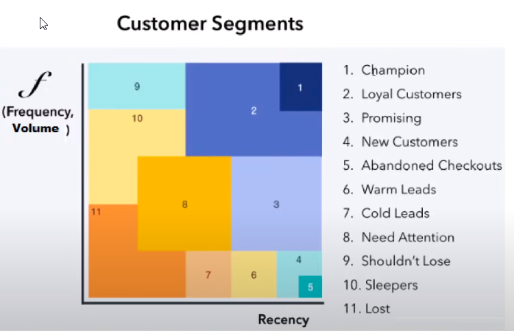
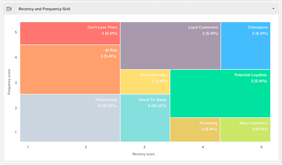
By doing an internet search on the term (RFM) You can easily find some examples of the representation of these variables in matrices:
Source
Source
We can read these graphs as follows: the higher the recency, which means, the more recent the date of last purchase, the more to the right the customer is positioned (the higher the value on the X-Axis). And the higher the purchase price, the higher the position on the Y-Axis will be. See that the Champions segmentation is in the upper right corner and this is our “best customer”. Also, note that a new customer will always be displayed at (R5; F1).
There is also a very cool example Renan Rodrigues did in Power BI and made it available on this link aqui.
There are two ways to perform segmentation based on RFM: Percentile (quartile) or Business Rules. We will work with the second option.
Scenario
Let’s assume that our database is from an online electronics company. We will have the following tables fvendas (fSales), dCalendario (dCalendar), dCliente (dClient), the traditional ones we always use, ok ?!
Defining Business Rules
You are the one who knows how to define the rules (segments) for your business. Let’s define the segmentation for our example like this:
1) Recency
| R1 | Between 181 and 360 days |
| R2 | Between 121 and 180 days |
| R3 | Between 61 and 120 days |
| R4 | Between 31 and 60 days |
| R5 | Last 30 days |
2) Frequency (number of purchases in the last 12 months):
| F1 | 1 time |
| F2 | Between 2 and 5 times |
| F3 | Between 6 and 9 times |
| F4 | Between 10 and 11 times |
| F5 | 12 times or more |
The same can be done for item 3) Monetary Value, ok ?! Let’s do just 1 and 2 for example purposes.
Static Segmentaion
Let’s start with an example of static segmentation.
The first step is to create a DAX measure to return the last purchase date:
Last Purchase =MAX ( fVendas[Data Venda] )
We will also need a measure to calculate the amount of sales for the last 12 months:
Sales Amount 12M =CALCULATE (
[Qtd Vendas];
DATESINPERIOD (
//Returns all 12 month dates back
dCalendario[Data];
MAX ( dCalendario[Data] );
-12;
MONTH
)
)
Now we are going to classify customers according to those business rules we talked about. For this, we will add a calculated column in table dCliente. Note that we are going to test some variables that will be used in our calculated column so that you can track the result of each variable. Let’s do it in steps!
Calculating the number of days since the last purchase:
Recency =VAR vToday =
MAX ( dCalendario[Data] )
VAR vdiasUltimaCompra =
DATEDIFF ( [Última compra]; vToday; DAY )
RETURN
vdiasUltimaCompra
Note that we didn’t use the TODAY () function in the vToday variable because in our example the database is ‘static’ (it only contains data until 2018), ok ?!
This variable vDiasUltimaCompra will return the number of days passed after the last purchase of each customer. The DATEDIFF function using DAY as the last argument will return the range of days between the two specified dates. Remember that the first argument is the ‘smallest’ date (oldest) and the second argument is the ‘largest’ (most recent).
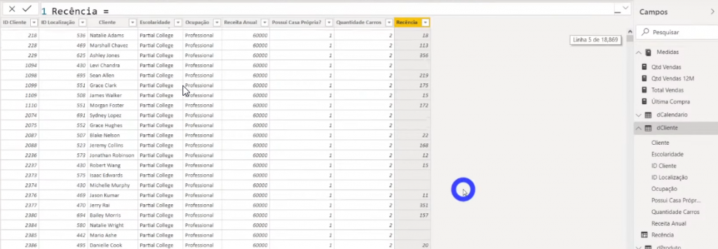
Note that there are blank lines in our Recency column because there are customers in our dClientes base who have never purchased. An example in which this occurs is when our base has prospects. A prospect is a potential customer who must meet certain criteria. It’s as if the client is still in the ‘negotiation’ phase.
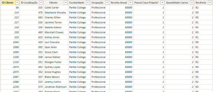
Now let’s use the SWITCH function to classify each interval, see:
Recency =VAR vToday =
MAX ( dCalendario[Data] )
VAR vDiasUltimaCompra =
DATEDIFF ( [Última Compra], vToday, DAY )
VAR vResult =
IF (
[Última Compra],
SWITCH (
TRUE (),
vDiasUltimaCompra <= 30, “R5”,
vDiasUltimaCompra <= 60, “R4”,
vDiasUltimaCompra <= 120, “R3”,
vDiasUltimaCompra <= 180, “R2”,
vDiasUltimaCompra <= 360, “R1”,
“R0”
),
“R0”
)
RETURN
vResult
Note that there is an IF before the SWITCH because we need to take into account those blank values we mentioned, remember ?! This IF will check if there is value in the Last Purchase measure. If it exists, we will use the SWITCH function, otherwise we will return R0. See the result:
Let’s do exactly the same to calculate the Frequency, see:
Frequency =VAR vQtdVendas12M = [Qtd Vendas 12M]
VAR vResult =
IF (
[Qtd Vendas 12M],
SWITCH (
TRUE (),
vQtdVendas12M = 1, “F1”,
vQtdVendas12M <= 5, “F2”,
vQtdVendas12M <= 9, “F3”,
vQtdVendas12M <= 11, “F4”,
vQtdVendas12M >= 12, “F5”,
BLANK ()
),
“F0”
)
RETURN
vResult
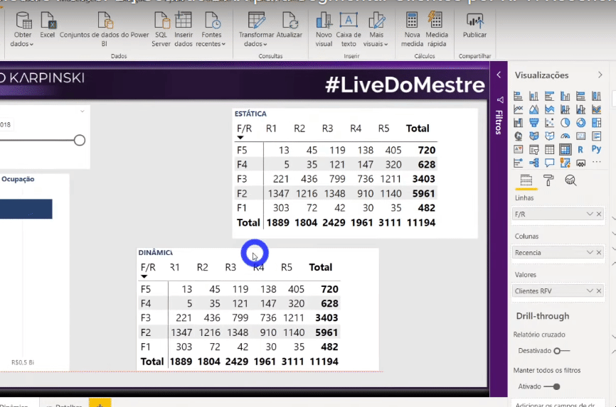
We are going to add a matrix to visualize the data we just built. Just select the matrix visual and drag the fields as shown in the image:
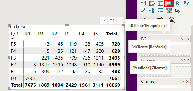
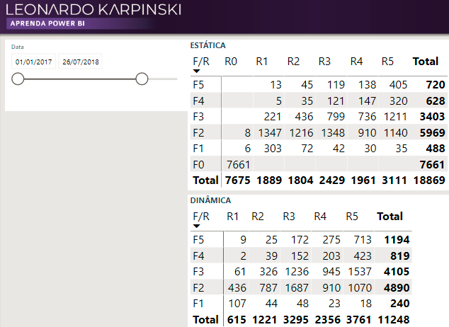
Note that if we add a date segmentation to this page, the matrix will not change its values because we are doing static segmentation, ok ?!
Let’s make the dynamic segmentation?!
Dynamic Segmentation
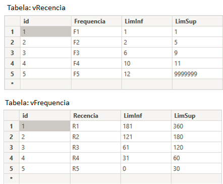
We know that we can’t add measures to the graph axes, right ?! Then we will need to create two auxiliary tables (for frequency and recency) and insert those values that we defined earlier.
Auxiliary Tables
Let’s create our auxiliary tables based on our business rules (previously defined):
We will do the same to create the auxiliary recency table. The two tables created (vRecencia and vFrequencia) looks like this:
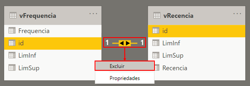
Note that, after adding these two tables to the model, Power BI will automatically create a relationship between them (because there is a common column: id). But we don’t want that! We will then need to delete this relationship created because these auxiliary tables should not be related to any of the tables in our model.
When inserting a table view with ID Cliente, Frequencia, LimInf (Minimum), LimSup (Maximum), and Sales Qty 12M we will notice that this last value is repeated in all segments (F1 to F5) but what we want is for the quantity to appear only in the range we have defined. For example: when the line has Qquantidade equal to 5, the Frequencia column should only show Frequency equal to F2. Well, then we will need to create a measure with DAX to correct this, right ?!
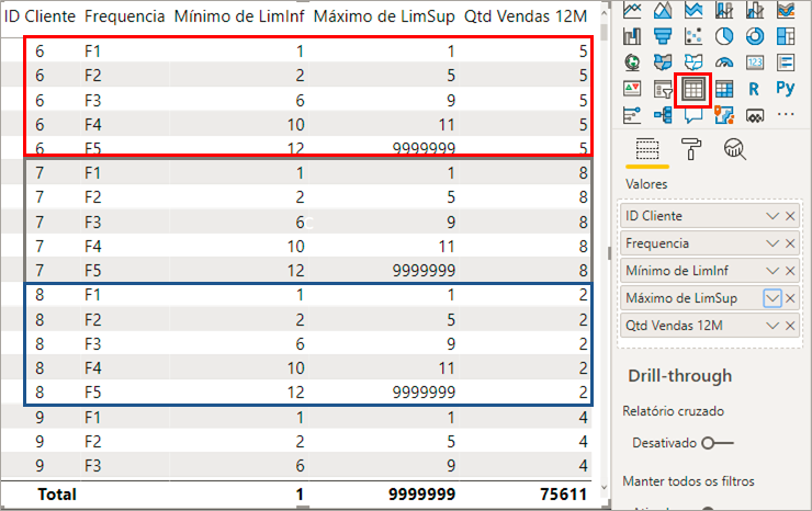
See how the measure looks:
Clientes RFV =VAR vToday =
MAX ( dCalendario[Data] )
VAR vResult =
CALCULATE (
[Clientes],
FILTER (
VALUES ( dCliente[ID Cliente] ),
[Qtd Vendas 12M] >= MIN ( vFrequencia[LimInf] )
&& [Qtd Vendas 12M] <= MAX ( vFrequencia[LimSup] )
&& DATEDIFF ( [Última Compra], vToday, DAY ) >= MIN ( vRecencia[LimInf] )
&& DATEDIFF ( [Última Compra], vToday, DAY ) <= MAX ( vRecencia[LimSup] )
)
)
RETURN
vResult
How does this unrelated table interact with the rest of the graph?
Soares, Elizeu
When I compare these measures with the vFrequencia and vRecencia tables, PBI makes a virtual relationship in the background.
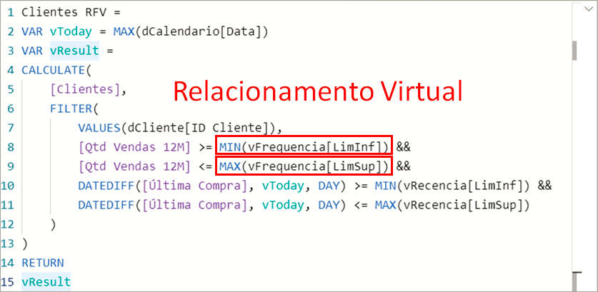
See that for any new analysis that needs a certain value in the segmented view, we need to create a new measure and use this virtual relationship as was done in Clientes RFV (RFV = RFM in portuguese).
Example: let’s imagine that we need the Vendas Total (Total Sales) segmented and we already have the Vendas Total measure. Our Vendas Total RFV measure will look like this:
Total Vendas RFV =VAR vToday =
MAX ( dCalendario[Data] )
VAR vResult =
CALCULATE (
[Total Vendas],
FILTER (
VALUES ( dCliente[ID Cliente] ),
[Qtd Vendas 12M] >= MIN ( vFrequencia[LimInf] )
&& [Qtd Vendas 12M] <= MAX ( vFrequencia[LimSup] )
&& DATEDIFF ( [Última Compra], vToday, DAY ) >= MIN ( vRecencia[LimInf] )
&& DATEDIFF ( [Última Compra], vToday, DAY ) <= MAX ( vRecencia[LimSup] )
)
)
RETURN
vResult
Note that it is almost identical to Clientes RFV and the only change is the first argument of the CALCULATE function.
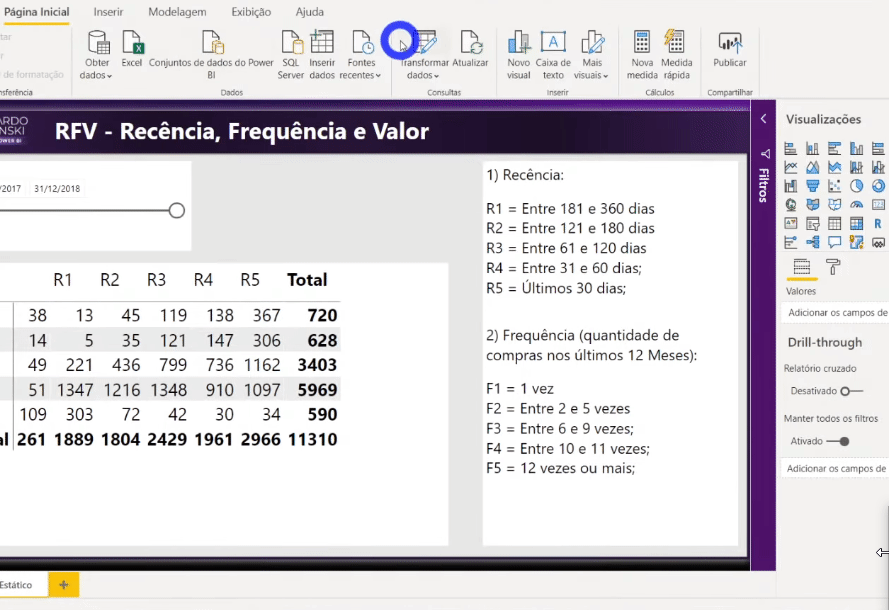
Note that when comparing these two ways of segmentation (static and dynamic) we can see that when we edit the Date filter, the static matrix continues to present the same values while the dynamic matrix respects this external filter and correctly changes its values.
Drill-through on buttons
Now we are going to use a very nice feature from the last Power BI Desktop update (a button that enables drill-through).
Let’s first create a page to detail customers according to the selected range. Look:
Steps:
Create a new page → Insert a customer detail matrix → In the Views panel, drag the Frequency and Recency columns (from the vFrequencia and vRecencia tables) → Rename this page to "Details"
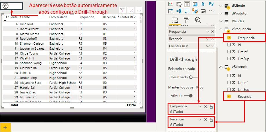
After adding the Frequency and Recency columns in Drill-through, a Back button will automatically appear.
Going back to the page we were on before (with the matrices), let’s add a blank button.
Steps:
Insert → Buttons → Blank → In the Views panel → Activate the Action option → Select the name of the page we just created (Details)
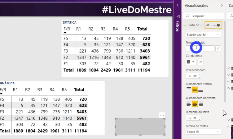
After adding this button, just format it:
Formatting:
In the Views panel → Enable Button Text → With Default State selected, change the Button Text to "Detail Customers" → With Disabled selected, change the Button Text to "Select a Range"
What is the difference between drill-down and drill-through?
Matheus Lima
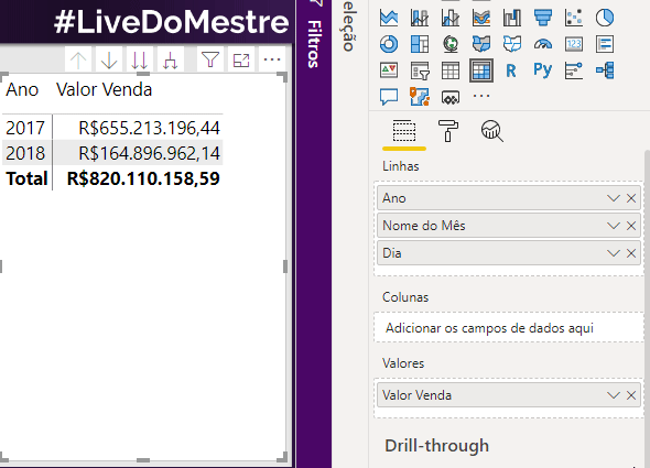
Drill-through is when we want to expand more details in relation to the visual we have (this example we did shows more information than what we selected in the matrix). Drill-down is when you want to navigate from one hierarchy to another. Example: you are in a year view and go to a monthly view. Look:
Well, guys, that was the content of our Live # 23! I hope you have understood the importance of customer segmentation and the range of insights that will become available from the analysis of the RFM matrix.
If you have any questions or suggestions for a next Live subject, leave it in the comments.
Regards,
Leonardo.