
Hi Guys!
Welcome back!
In this lesson I will talk about Data Visualization and Storytelling. I will give you 9 recommendations to create more interactive dashboards, by changing background, colors, aligning the visual and more!
All my videos tend to be longer than normal because I like to dig deeper into the subject so you can learn for real.
Before we start with our lesson, don’t forget to subscribe to the Power BI Week. A free and online event where I will teach everything I know about PBI! You don’t want to lose this opportunity!
Hope you enjoy!!
On our first lesson, we talked about the 7 pillars for mastering Power BI, and in this third lesson, we are going to talk about the fifth pillar: Visualization. Which means we are going to talk about Data Storytelling.
What is Data Strotytelling?
According to the TDWI Glossary, it means the power of building a narrative around a set of data to help convey the meaning of that data in a powerful and compelling fashion. Thus, is a guide that gently leads your audience through the analysis. As you can check in the link: https://tdwi.org/portals/what-is-data-storytelling-definition.aspx
The main idea of dashboards is they must give the answer is been looked for just by looking at the analysis, without explaining or any question. It must always be easy to understand.
I also show what you shouldn’t do with dashboards, just like the example below:

In order to create great visual you should always keep the recommendations below in mind:
- Be concerned about design – really important!! This is the first thing people see in your dashboards.
2. Identify your audience – Once you do that, you will have a better idea to:
– Ask how a dashboard will be used and design for next step actions.
– What information does the reader need to be successful? (Key words: KPI’s – Indicators)
– How much detail does the reader need? You have to pay attention to this one because you will have to change information depending on whom you are going to send to and what are the most important information one needs.
3. Draw a sketch *
– Good design should tell a story with data that does not become overwhelming with way too much information, clutter or noise.
– Limit content to fit entirely on one screen. (This is a personal opinion, okay? Even though I think it gives a way better look in the dashboard)
– Keep your dashboard simple with only a 3 to 5 key values, charts, or tables. Avoid putting too much information on a dashboard.
– If detail tables are needed, place them on the bottom of the dashboard
4. Choose the right theme and keep consistency. This way the user automatically associates the color with the information in any other moment of the dashboards.
5. Change the background (WOW effect). Do I need to say anything after highlighting this topic?! Ha ha This is extremely important for your presentation!
6. Use icons and images to add context (https://logomakr.com).
After downloading the image you need, to insert in Power BI you go to the tool bar, click on “Insert” and then on “Image” select from where you want to search, choose and use it!
7. Align all visuals properly
8. Choose the right visuals **
An important tip for you: whenever you need to compare values that change over time, use it in a horizontal, this means time in x-axis.
When you have a category that you want to compare, we use it in the y-axis.
9. Use visualization features from Power BI (tooltip, drill-through, bookmarks…)
Tip: * Whenever you are building a dashboard, start from the upper right and make it in a “Z” field of vision.
Tip: ** Use columns charts for time and bars for categories.
When you use card to show number, it is nice to use it along with a KPI’s so the user can tell whether that is good or bad info.
Regarding the charts, in the link in the description there are guide chart to you to use whenever you want to make sure you are using the correct one. Also “dos and don’t” to help you to be even more accurate.
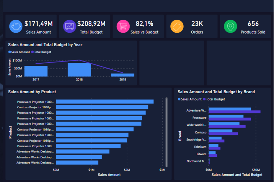
As per the figure below, you can see that there is consistency, as I mentioned in item 4.
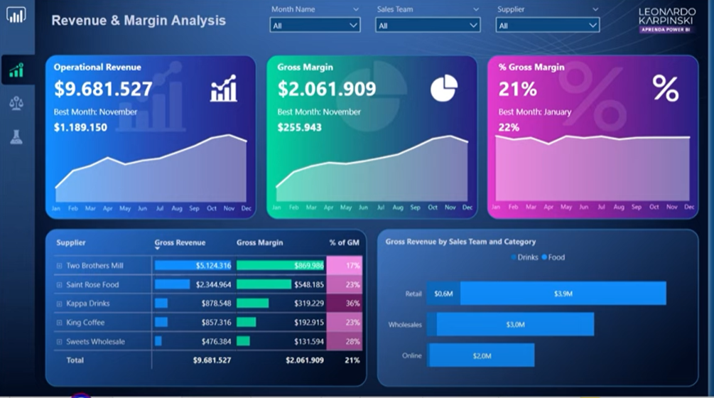
Blue: Gross Revenue
Green: Gross Margin
Pink: % Gross Margin
If I delete the background, it will still make sense, right? Yes, but the design would not! The information would seem disconnected.
Just to remind you that I have provided in the bio the link to the Power Point file as a bonus that has some backgrounds options. Use it wisely! ? And sure, make the changes you feel appropriates.
Example
Please, check the dashboard below and tell me if it is consistent.
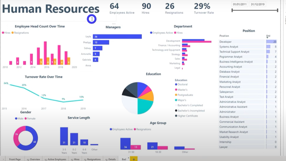
There are many information. You can’t understand a thing, right? Let’s make a way better?
Take a look:
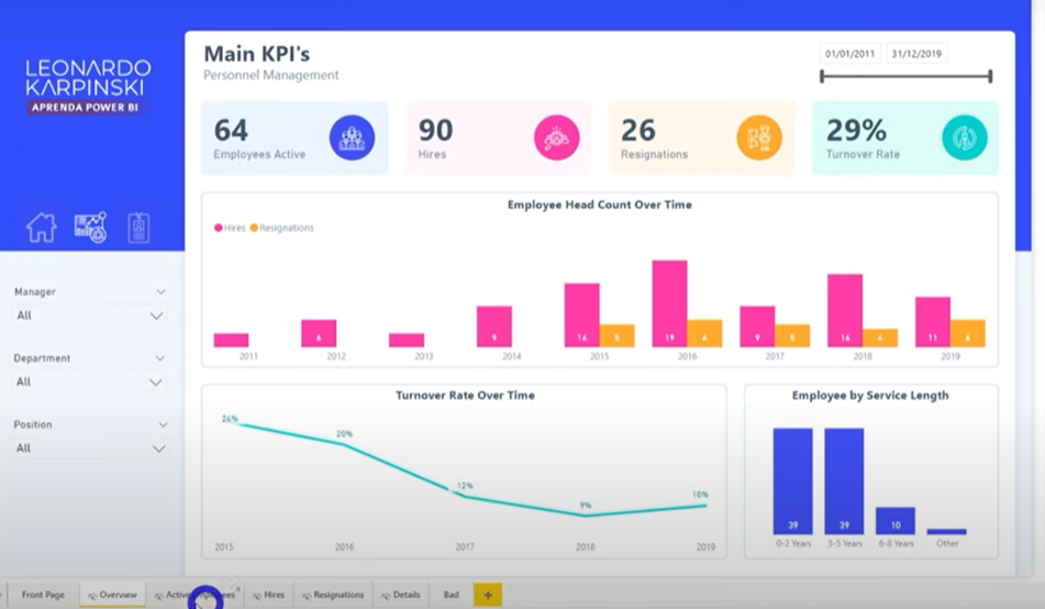
In order not to make it even more confusing, let’s divide it into 4 tabs.
Just like in the example, let’s see how we can even improve our dashboard.
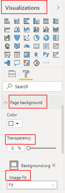
First, change the background.
Go to “Visual” – “Page background” – “+ Add image” – Select the image you want
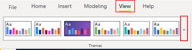
Now let’s change the color and theme:
Tool bar – “View” – Choose the theme you think it’s more appropriate for your information.
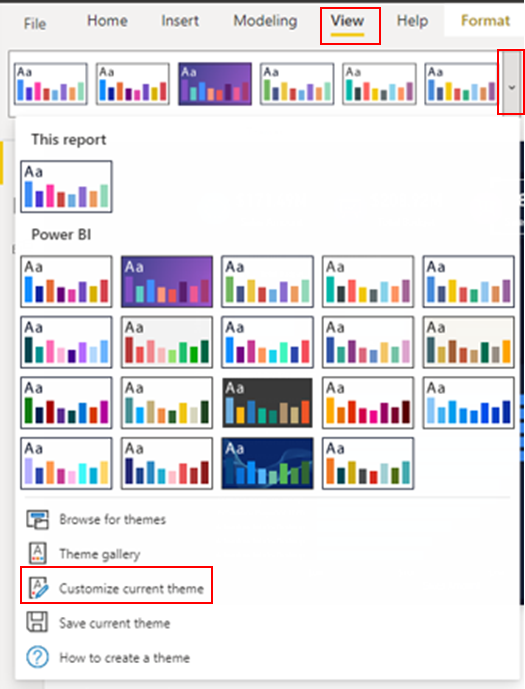
Also, we can customize any theme:
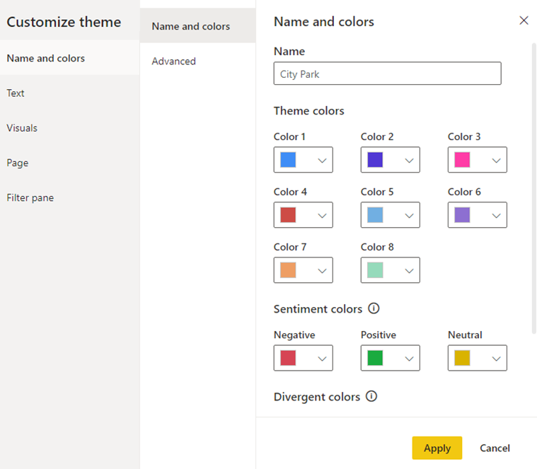
Tool bar – “View” – “Customize current theme”
Remember to always keep the consistency, okay??
After the adjustments, Voilà:
These links below are helpful links to learn more about data storytelling.
That’s it for today, guys!
Hope you liked this video and learned more about Power BI!
Don’t forget to like this video and to subscribe!
See you next Thursday!
Cheers,
Leonardo